

HAGIWARA Hideo (萩原英雄)
|
 Hagiwara Hideo (萩原英雄 1913-2007) was a preeminent Japanese artist during the second half of the twentieth century who introduced inventive techniques and customized tools to the art of the Japanese woodblock print. He was born in Kôfu City, Yamanashi prefecture. He moved to Korea with his family in 1921, but in 1929 returned on his own to Japan, where he entered second middle school of Nihon University and began studying oil painting with Usaburô Mimino (1891-1974). After graduating in 1932, he enrolled in the art department of the vocational school Bunka Gakuin (文化学院) and began exhibiting oil paintings. In 1933, he entered the Tokyo Bijutsu Gakkô (東京美術学校), now called the Tokyo Geijutsu Daigaku (Tokyo University of the Arts: 京藝術大学), for further study in oil painting. By 1934 he was studying with the early sôsaku hanga artist Minamu Kunzô (南薫造 1883-1950). He also attended the extracurricular woodblock printing course taught by Hiratsuka Un'ichi. After graduating from Tokyo Bijutsu Gakkô in 1938, he worked as a quality controller of recut facsimile woodblock prints in the planning department of the Takamizawa Mokuhan Company (高見沢木版本社) where he cultivated his knowledge of ukiyo-e prints.
As the Pacific War began, Hagiwara started making sôsaku hanga prints (both figurative and abstract). He was conscripted into the army in 1943, and in May of 1945 he lost his house and workshop and nearly all of his early artworks and personal belongings in the Allied bombing of Tokyo. His first solo show of paintings took place in December, 1951, but in May 1953 he contracted pulmonary tuberculosis that required treatment in a military sanitarium until January 1956. During his long recuperation, he began making New Year's and greeting-card woodcuts. In March 1956, he had his inaugural hanga show, which was held at the Yôseidô Gallery (養清堂画廊) in Ginza, Tokyo (41 figurative woodcuts, including 11 prints from a series titled The 20th Century). Thereafter, starting in 1958, he participated in yearly Japanese gallery and International print exhibitions (some involved invitations to submit specific works; see below) and received many honors and awards.
In his signature works Hagiwara achieved a sensual and richly evocative quality by printing on the back of the paper, allowing bleed-through to serve as a "ground" to enrich the image on the front. He said that his goal was to achieve depth (referring to it as "a sense of deep space," ukabuka to shita kûkan o satoru, 深々とした空間を覚). He found that the subdued colors bleeding from the back established an atmosphere or mood that he could then work with when applying colors on the front side of the print. To do this, he experimented with double-sided printing (ryômen-zuri, 両面刷り), developing the idea after working at the Takamizawa company where he became fascinated with the colors showing through on the reverse sides of ukiyo-e prints. He claimed this was new to printmaking. Hagiwara did not seem to acknowledge Munakata Shikô's related technique of reverse-side coloring as an influence, probably because the older artist painted (brushed on) colors on the back of many of his prints, doing so after printing the front sides. So Hagiwara's technique was indeed different, as the backs were printed first and the front-side work was done afterwards. This required working from dark to light on the front, which did not apply to Munakata. In some works Hagiwara used a metal coil to rub on the back, creating baren-like swirls. For front and back views of an early print incorporating ryômen-zuri, see the pair of images below illustrating Hagiwara's Sanshoku sumire (Pansy: 三色菫) from 1960.
 |
 |
| Hagiwara Hideo: Sanshoku sumire (三色菫), 1960 Front view Woodblock print with ryômen-zuri (両面刷り) Edition of 30 (paper: 670 x 385 mm) |
Hagiwara Hideo: Sanshoku sumire (三色菫), 1960 Back view Woodblock print with ryômen-zuri (両面刷り) Edition of 30 (paper: 670 x 385 mm) |
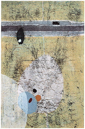
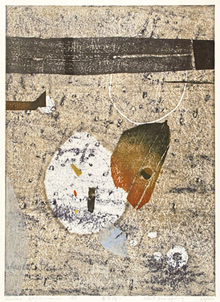
Hagiwara first published prints using his ryômen-zuri technique in 1959, although he was developing it at least as early as the previous year. One of these works was Rakuyô (1) (Autumn leaves or Fallen leaves no. 1: 落葉) shown at the top of this web page. This early design already exhibits much of Hagiwara's mature vision and technique. The medium-format sheet (image: 446 x 284 mm; paper: 480 x 330 mm) was produced in an edition of 30 on nishinouchi paper (西ノ内紙) from three blocks needing 11 stages of color printing. The dark bleed-through is visible where the front colors are scratched and scraped. Texture overall plays a significant role in expressive rendering of the forms, lines, and colors. There is a weathered appearance to the image, as if it were itself hardened earth or an old board or stone revealing natural aging. In fact, the opaque colorants are so thick (a nearly ubiquitous characteristic of Hagiwara's prints) as to suggest such an interpretation.
In the 1960s Hagiwara developed a method of scoring the block and printing in an intaglio manner, as would be done with engraving, etching, or drypoint. Hagiwara used sharpened nails or spikes set in handmade handles to scratch lines and shapes into a plywood board. He then inked the blocks and gently wiped the surface as one would do with an intaglio metal plate, leaving behind pigment inside the lines. Next, he applied strong pressure with a baren to the paper placed face-down on the board in the traditional woodcut method so that the sheet would pick up the pigment left below the surface in the scratched lines and transfer the image to the paper. Hagiwara also sometimes used an intaglio-related method of stopping-out by applying a varnish to repel dyes from areas or shapes he did not want affected by the colorant. He said that he always used gouache or poster paints for his opaque pigments, and dyes for his transparent colorants. (N.B. Dyes are chemicals that are soluble in a liquid medium, whereas pigments are particles suspended in a medium and do not dissolve.) His design Yoroeru hito no. 20 (Man in armor no. 20: 鎧える人 no. 20), not shown on this web page, included this technique, where he printed the colors (opaque poster colors or a mix of those plus a gray dye) on the main forms and then covered them with varnish so that he could apply a gray dye throughout the heavily textured background.
Another exploratory technique used by Hagiwara can be found in a design from his Mask series (Kamen no. 11; 仮面 no. 11; not shown here), Hagiwara cut out shapes from a shina-faced plywood, inked them with various colors, reset them in their original positions, and finally printed all the colors for the entire design simultaneously. This sort of jigsaw-puzzle approach was, of course, known in the West, particularly in the works of the Norwegian artist Edvard Munch (1863-1944). Long after Munch, several Japanese artists also took up the technique. However, it was an unusual sort of printing method for Hagiwara, who otherwise focused heavily on his combinations of traditional woodcut and ryômen-zuri techniques.
Hagiwara's most widely acclaimed works are his abstractions, which he introduced in 1958. at the International Triennial of Colored Graphics, Grenchen, Switzerland. As his accomplishments in printmaking became more widely known and admired in Japan and around the world, he stood, arguably, as Japan’s dominant print artist after Munakata Shikô's death in 1975. Hagiwara expanded the limits of hanga through technical innovations such as the introduction of printing with intaglio-style incised lines in wood boards, the use of custom inks, and unconventional handmade tools and media such as nails or spikes, wire barens (rubbing tools: 馬楝), heating coils (also used as barens), and sawdust glued to blocks. Hagiwara visualized designs and then carved directly and spontaneously into the boards without relying on preliminary sketches. Although he concentrated almost exclusively on block printing, he also pursued, from time to time, lithography, etching, and stencil printing. He used pigments and dyes in his works, often combining the two in a single composition.
_volcanic_ash_610w.jpg) |
| Hagiwara Hideo:Dojô (2) Kazanbai ("Soil (2) Volcanic ash": 土壌 (2) 火山灰), c. 1960 Woodblock print with ryômen-zuri (両面刷り), edition of 30 (paper: 600 x 460 mm) |
Hagiwara's first large series was titled "Soil" (土壌), produced in 1960 in both horizontal and vertical formats and issued in two groupings. The example shown above is from the second group, titled Dojô (2) Kazanbai ("Soil (2), Volcanic ash": 土壌 (2) 火山灰), a ryômen-zuri-e (両面刷り絵) with sprinkled mica from an edition of 30 in moderately large format (600 x 460 mm). The complex main section is scored as if marred by cracklure with the dark back-printing emerging through the front-side overprinting and the swirls from the baren pressure also visible on the front.
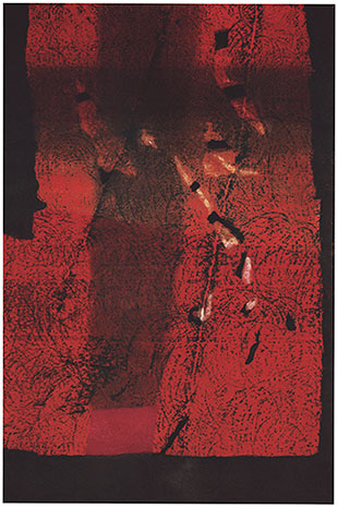
On the left below is Hagiwara's Aku no hana ("Devil flower": 悪の華), also called "Aborted flower" (仇花), from 1960. It measures 578 x 407 mm and was made in an edition of 30 on hôsho paper (奉書) from four blocks and 14 stages of color printing. With the use of bleed-through from the back, Hagiwara worked from dark to light on the front as he built up his image. In Aku no hana, the flower seems to emerge from a primordial black hole surrounded by complex textures and a swirling pattern of baren lines. Given the title, perhaps Hagiwara meant to imbue this work with an hopeful feeling of life emerging from an inhospitable or elemental source.
 |
 |
| Hagiwara Hideo: Aku no hana (悪の華), 1960 Woodblock print with ryômen-zuri (両面刷り) Edition of 30 (578 x 407 mm) |
Hagiwara Hideo: Ishi no hana — aka (石の花 赤), 1960 Woodblock print with ryômen-zuri (両面刷り) Edition of 30 (870 x 580 mm) |
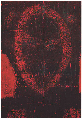
Throughout his career, Hagiwara created prints in series or sets. Among the most highly praised of all Hagiwara's works is his Ishi no hana (Stone flowers: 石の花) series composed of 15 prints in which a dark pigment was forced through the paper from the back to serve as a colored ground for the designs. Starting from the year they were created, in 1960, these prints were immediate hits with the critics, and within months Hagiwara was invited to submit three from the series (the "red," "black," and "gray" variants) to the Second Tokyo International Print Biennale in November 1960, where he was awarded a prize. From that time forward and for the remainder of Hagiwara's life, designs from the Stone Flower series appeared regularly at gallery exhibitions and print biennales. Ishi no hana — aka (Stone Flower — Red: 石の花 赤) is shown above right. It is a large print (870 x 580 mm) made in an edition of 30 on torinoko paper (鳥の子紙) from five blocks and 20 stages of color printing. While the intense deep red with its pitted irregularities set against the black background is the most assertive aspect of this work, the circular markings of the baren were purposely introduced to create an expressive, rhythmic tension within the design.
As the previous images illustrated above indicate, the years 1959 through the early 1960s represented a significant time for Hagiwara, an achievement coming at virtually at the beginning of his career. Many of his best works appeared during the first decade or so of his active period in woodblock printmaking. Among these heralded designs, Shiro no gensô no. 2 (Fantasy in white no. 2: 白の幻想 no. 2) from 1962 was produced in an edition of 30 on torinoko paper using three blocks and three stages of color printing (see below left). An impression of this work was submitted to the Fifth Ljubljana International Print Biennale in 1963, where it won the Yugoslavia Scientific Art Academy Award. It is difficult to reproduce the print in small size, but the illustration below left does at least capture some of the subtle texturing and karazuri ("empty-printing" or embossing without color: 空摺) used by Hagiwara to apply expressive printing effects in contrast to the deep ryômen-zuri verso color and the front-surface build-up of heavy but nevertheless rather subdued white, pink, and pale yellow colorants.
 |
 |
| Hagiwara Hideo: Shiro no gensô no. 2 (白の幻想 no. 2) Woodblock print with ryômen-zuri (両面刷り), 1962 Edition of 30 (paper: 850 x 595 mm) |
Hagiwara: Kodai no uta (Ancient Song: 古代の唄) no. 9 Woodblock print, 1965 Edition of 50 (paper: 1,000 x 670 mm) |
An important group of impressively large-scale prints is Hagiwara's Kodai no uta (Ancient Song: 古代の唄) series whose image heights measure about 1,000 mm on torinoko paper. Only some of the designs in the series were made with the ryômen-zuri technique. One example is Kodai no uta (Ancient Song: 古代の唄) no. 9 from 1965 in an edition of 50 (shown above). Radiating from irregular, concentric oval shapes are glyph-like forms that might suggest we are reading a pictograph from antiquity. It is as if, symbolically, we are in the presence of an ancient communication whose markings are meant to be understood.
Other designs exhibiting substance and strength are those found in Hagiwara's Yoroeru hito (Man in armor: 鎧える人) series from 1963. Numbering at least 20 prints, the works were done on torinoko paper in editions of 30. An example is shown below left, titled Yoroeru hito no. 17 (Man in armor no. 17: 鎧える人 no. 17). It was made with two blocks and required two color stages. Texture, form, and embossing are of primary interest in this work, as are the subtly differing shades of glowing orange. The monumental size of the print (image: 855 x 595 mm) on paper measuring 992 x 668 mm give the design a totemic power, suggesting with only a few forms the tassets of body armor and the lower curve of a helmet.
His Kamen no. 6 (Mask no. 6: 仮面 no. 6) from 1964 dispensed with ryômen-zuri altogether but nevertheless attained depth and drama with few colors and anthropomorphic forms emerging from a black ground. The large design (image: 910 x 615 mm) was printed in an edition of 50 that required an economical three stages of color printing on torinoko paper. The ghostly suggestion of a hazy face hidden behind a mask leaves us with a haunting image.
 |
 |
| Hagiwara: Yoroeru hito no. 17 (Man in Armor no. 17: 鎧える人 no. 17) Woodblock print, 1963 Edition of 30 (paper: 992 x 668 mm) |
Hagiwara: Kamen no. 6 (Mask no. 6: 仮面 no. 6) Woodblock print, 1964 Edition of 50 (image: 910 x 615 mm) |
In a surprising change of direction, Hagiwara released a large series of 42 designs on the theme of Greek mythology in 1965. The entire series was issued as a complete portfolio bound in a black woven material, imprinted in silver. Hagiwara employed both traditional Japanese woodblock technique as well as intaglio on these prints.. The compositions were figurative and the formats either horizontal and vertical, and of medium-large size (610 x 457 cm) in editions of 50 each. The quality of Hagiwara's unmodulated "scratched" lines recall some of the etchings in Picasso's Vollard Suite (1930-37), and it is not impossible that Hagiwara would have been familiar with the set. The technique in the print shown below, Leda, is noteworthy as it combines the woodblock "intaglio" method for the forms of Leda and the swan, along with wood-engraved lines in the complex background. The application of gray on the bed seems to mimic aquatint in Western intaglio prints.
 |
| Hagiwara Hideo: Leda, 1965 Woodblock print, edition of 50 (paper: 610 x 457 mm) |
We can also see the results of the scratched-line technique in some of Hagiwara's works from the late 1960s when he began exploring a kind of graffiti-like quasi-figuration in his designs. His very large Den'en no matsuri (Village festival no. 2: 田園の祭り no. 2) woodblock print from 1968 was printed in an edition of 50 (see illustration below). There are hints of human forms, but they are barely rendered in a naturalistic manner. The lines, which seem drawn rather then carved, were made with Hagiwara's woodblock intaglio method. Hagiwara was also making lithographic prints at this time, which might have influenced his choosing to render lines of this quality in Den'en no matsuri. Given that Hagiwara was teaching at Oregon State University in early 1967, the influence of Western art seems incontrovertible here, given that he was likely aware of American artists working in similar modes. One thinks, perhaps, of the many untitled "scribbled" paintings by the American artist Cy Twombly (1928-2011) from the 1960s (or titled works such as "Dutch Interior" from 1962 at the MET in NY). Perhaps even more likely, certain works by Spanish Surrealist Joan Miró (1893-1983), such as his "Constellation" series of 1939-41, would have come to Hagiwara's attention, even when he was back in Japan, where Miró was quite popular. Hagiwara's lines and forms have an anthropomorphic appearance, although it is difficult to decide exactly what is on display in Den'en no matsuri. Perhaps it is meant to suggest the blur of crowds at such festivals.
 |
| Hagiwara Hideo: Den'en no matsuri (Village festival no. 2: 田園の祭り no. 2), 1968 Woodblock print, edition of 50 (paper: 657 x 992 mm) |
Hagiwara's designs from his 1968-69 "Sâkasu (Circus)" series display a similar scratched-line figurative vocabulary, although the human forms are still only partly discernible. The example shown below is titled Sâkasu no. 6 (Circus (No.6): サーカス No. 6) issued in 1968 in an edition of 50 on torinoko paper measuring 416 x 676 mm. Three blocks were used and there were 13 stages of color printing. Here the influence of Joan Miró is more obvious than in the above Den'en no matsuri from the same year.
 |
| Hagiwara Hideo: Sâkasu no. 6 (Circus No. 6: サーカス No. 6), 1968 Woodblock print, edition of 50 (paper: 416 x 676 mm) |
Hagiwara produced a large number of naturalistic views of Mount Fuji, the earliest apparently in 1960. In the following design, Sora Moeru (The sky is aflame: 空燃える) from the series Sanjuroku Fuji (Thirty-six Fujis: 三十六富士), Hagiwara portrayed the sacred mountain from close to the north end of Lake Ashinoko (芦ノ湖), looking north-west. Red light from the setting sun refracts into a flaming sky. The clouds are dusted with mica, enhancing the overall granular texture that is a hallmark of Hagiwara's prints. There are echoes here of Hokusai's Gaifû kaisei (South wind, clear sky: 凱風快晴 known as "Red Fuji") in the particular shapes and formations of clouds and the bokashi (gradation printing: 暈) of the lower slope. Hagiwara announced in 1979 that he had already been collecting ideas for the series for more than 10 years and and that he had begun preparing the blocks in 1977. Upon the completion of the series in 1986, Hagiwara confessed that it had been difficult project, stating in the postscript to the publication accompanying the set that it had taken him 25 years. As he put it, "Just when I think I have grasped [Fuji], it slips through my hands." [see Clark ref. below.] Indeed, Hagiwara continued designing prints of Fuji until the end of the 1990s.
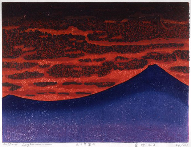 |
| Hagiwara Hideo: Sora Moeru (The sky is aflame: 空燃える), c. 1977-86 Series: Sanjuroku Fuji (Thirty-six Fujis: 三十六富士) Woodblock print with sprinkled mica, edition of 100, design no. 11 (paper: 450 x 565 mm) |
As Hagiwara's career progressed, he continued to use the ryômen-zuri technique in some of his prints, although with decreasing frequency. By the 1980s, if not sooner, he could achieve a similar effect with traditional front-side printing only. Compare, for example, the two later works shown below. On the left is his design titled Haru no matsu (Waiting for spring: 春の待つ) from 1985 in an edition of 100 (paper: 467 x 638 mm). Here, the bleed-through printing on the back was used, as well as sprinkled mica on the front. Seven years later, in 1992, Hagiwara selected his design titled Fuyû ("Floating": 浮游) for use as the original woodblock print to be inserted as a frontispiece in the volume on his oeuvre for the book series Nihon gendai hanga (日本現代版画 given in English as "Modern Japanese Print Artists") published by Reifô Shobô (冷風書房) in an edition of 75. Unlike so many of Hagiwara's works, Fuyû is in fairly small format (345 x 267 mm) to accommodate inclusion in the book, but the technical quality remains very high. Here, the depth of colors and textures are similar to Haru no matsu, despite the absence of ryômen-zuri. Perhaps there is a slight loss of contrast as the gray undercoating does not emerge as dramatically as the darker bleed-through printing does on the front of Haru no matsu; however, this might have been intentional. The pigments are thick and hard on Fuyû, and there is lightly sprinkled mica across the paper surface.
 |
 |
| Hagiwara Hideo: Haru no matsu (春の待つ), 1985 Woodblock print with ryômen-zuri (両面刷り) Edition of 100 (467 x 638 mm) |
Hagiwara Hideo: Fuyû ("Floating": 浮游), 1992 Woodblock print with sprinkled mica Edition of 75 (345 x 267 mm) |
Over the course of his career, Hagiwara held several teaching appointments and leadership positions in associations. In April-July 1967 he was a guest professor teaching woodblock printing at Oregon State University. In 1979 he was elected chairperson of the Nihon Hanga Kyôkai (Japan Print Association: 日本版画協会), a post he held until 1990. In 1987 Hagiwara was awarded the Tenth Noguchi Cultural Prize, and he was designated as a "Person of Cultural Merit" in Yamanashi Prefecture. The even more prestigious Fourth Order of Merit (Small Cordon of the Rising Sun) was bestowed upon Hagiwara in the name of the Emperor in November 1988. A year later, in 1989, the Nobel Prize Committee presented him with a gold medal for five prints based on themes from five novels by the Nobel laureate Kawabata Yasunari (川端康成 1899-1972). The first major U.S. retrospective exhibition of Hagiwara’s work opened in December 2019 at the Minneapolis Institute of Art.
Hagiwara received various exhibition prizes, including awards in 1960 (Second Tokyo International Print Biennale, Museum of Modern Art, Kamakura award), 1962 (Lugano International Print Exhibition, grand prize, Mayor's award), 1963 (Fifth Ljubljana International Print Biennale, Yugoslavia Scientific Art Academy Award for "Fantasy in white no. 2"), 1966 (Fifth Tokyo International Print Biennale, Minister of education award, Tokyo), 1967 (Seventh annual Ljubljana International Print Biennale, Rijeka Museum of Modern Arts award), and 1970 (First Banska International Woodblock Print Biennale prize).
Hagiwara's prints are in many major museums, including the Art Gallery of New South Wales, Sydney; Art Institute of Chicago; British Museum, London; Brooklyn Museum of Art, NY; Cincinnati Art Museum; Honolulu Museum of Art; Los Angeles County Museum of Art; Minneapolis Institute of Art; Museum of Art & History, Geneva; Museum of Fine Arts, Boston; Museum of Modern Art, Kamakura; Museum of Modern Art, NY; Museum of Modern Art, San Paulo, Brazil; Museum of Modern Art, Toyama; Museum of Modern Art, Wakayama; National Gallery of Art, Scotland; National Museum of Art, Osaka; National Museum of Art, Tokyo; Philadelphia Museum of Art; Portland Museum of Art; Tokyo Metropolitan Art Museum; Victoria & Albert Museum; and Vienna National Museum of Art. © 2020 by John Fiorillo
BIBLIOGRAPHY
- Blakemore, Frances: Who's Who in Modern Japanese Prints. New York and Tokyo: Weatherhill, 1975, pp. 153-155.
- Christie's New York: The Helen and Felix Juda Collection of Japanese Modern and Contemporary Prints (auction catalog]. New York, April 22, 1998, lots 330-346.
- Clark, Tim: 100 Views of Mount Fuji. London: British Museum Press, 2001, pp. 67-68.
- Hagiwara, Hideo: Hideo Hagiwara (萩原英雄), from the series Nihon gendai hanga (Modern Japanese print artists: 近現代版画). Tokyo: Reifû Shobô (冷風書房), 1992.
- Jenkins, Donald: Images of a Changing World: Japanese Prints of the Twentieth Century. Portland Art Museum, 1983, pp. 121-122.
- Johnson, Margaret and Hilton,Dale: Japanese Prints Today: Tradition with Innovation. Tokyo: Shufunotomo Co., 1980, pp.36, 80-91
- Kawakita, Michiaki: Contemporary Japanese Prints (Nihon gendai hanga: 日本現代版画). Tokyo: Kodansha, 1967, pp. 40-41.
- Petit, Gaston: 44 Modern Japanese Print Artists. Tokyo: Kodansha, 1973; vol. 2, pp. 174-181, nos. C78-C80, 235-240; and descriptive list of plates, pp. 112-119; descriptions of plates pp. 14-15.
- Petit, Gaston and Arboleda, Amadio: Evolving Techniques in Japanese Woodblock Prints. Tokyo/New Yor: Kodansha, 1977, pp. 57, 75, 90, 102, 128, nos. 30, 75, 145, 146.
Viewing Japanese Prints |