

INAGAKI Tomoo (稲垣知雄)
|
Inagaki Tomoo (稲垣知雄) was born in Tokyo and graduated from the Okura Commercial High School. He was introduced to printmaking by Kôshirô Onchi and Un'ichi Hiratsuka in 1923, when the older artists were producing the magazine Shi to hanga ("Poetry and Prints": 詩と版画). He acknowledged a great debt to the two masters, attending Shi to hanga meetings regularly and thereby taking his only tutelage in printmaking. He said that "Poetry and Prints convinced me that I wanted to be a print artist." Inagaki also studied commercial art with Hamada Masuji (浜田増治, 1892-1938) and took some drawing lessons with Shizuo Fujimori (藤森 静雄 1891-1943) in a Sunday class. In regard to Western art, which was so influential on many sôsaku hanga printmakers, Inagaki said, "I like some qualities and reject others in Matisse and Picasso" [Statler ref, p 164].
 |
"Cat Making Up' |
 Beginning in 1924, Inagaki published his first prints in magazines and journals, such as the aforementioned Shi to hanga, issue 13, 1924. Other magazines included Hanga ("Prints"), issues 6, 9/10, 11, 14; and Kitsutsuki ("Woodpecker"). He exhibited with the Nihon Sôsaku-Hanga Kyôkai ("Japan Creative Print Association") also in 1924. Inagaki became a member of the Nihon Hanga Kyôkai ("Japan Print Association") in 1932. As did many other artists of his generation, he participated in various post-war international competitions, including the Paris, Tokyo, and Lugano biennales. During most of his career, Inagaki, like nearly all of his contemporaries, could not make a living from printmaking. He once worked for a steel company, and starting in 1935, he taught at the Kyôhoku Commercial High School until 1951, when he joined the Japan Advertising Art School.
Inagaki is admired for his stylized designs of cats, although he did not begin publishing them until circa 1951. His earlier works included still lifes, floral subjects, landscapes, and views of towns. The iconographic "Cat Making Up" from 1955 (shown above) is among the most admired and best known works of the mid-century sôsaku hanga school. A single feline intent on grooming is depicted with its head drawn in two positions. This quasi-cubist rendering of forms owes something to Picasso, of course, but the bold carving of lines is perhaps most influenced by Hiratsuka's emphatic approach to line and form. The Art Institute of Chicago owns a full-scale preliminary monochrome drawing (ref. no. 1955.793) for "Cat Making Up", which was a gift from the artist. There is, as well, a tiny preparatory watercolor (162 x 116 mm) in a private collection (see above right). The reverse side has a barely legible, lightly pencil-sketched cat.
 |
 |
| "A couple of cats": First edition | "A couple of cats": Second edition |
The prints shown immediately above are large works. The first edition was numbered 50 and printed on paper about 630 x 460 mm circa 1958. It is signed "T. Inagaki" and titled "A Couple of Cats" in English. The recarved second edition numbered 210 and was printed on paper about 610 x 450 mm in 1964. In the later state there are changes in the blocks and colors throughout the design. In both states, the overlapping geometric shapes produce a statuesque harmony between the two felines, and there is a hint of cubism in the composition.
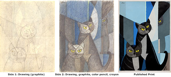 |
Oliver Statler (see reference below) wrote that Inagaki tended to favor the flat chisel, although he used a range of cutting tools for his blocks. Statler also claimed that Inagaki did not make "detailed sketches"; however, such preliminary drawings do exist. The small examples (277 x 211 mm) shown here offer a further glimpse into the Inagaki's approach toward printmaking. The graphite sketch (immediately above left) probes the initial ideas for the design. Two sullen or angry cats are placed along vertical and diagonal guide lines. In the more fully worked-out color drawing (above middle), done on the opposite side of the same sheet of paper, a third cat has appeared, lurking in the background and adding more depth and drama to the scene. Again, grid lines (horizontal, diagonal, and vertical) aided the artist in laying out the elements of his design. There is a much larger finished print from 1967 (immediately above right) that is very similar to the color drawing but measures 585 x 430 mm. Note, in particular, the most distant feline, whose upper body is hidden by the diagonal gray area, and yet the contour of the body is preserved by the vertical area printed with the same gray color block, paralleled by a narrow gray area for a leg and paw. This is a clever and effective use of stylized representational drawing blended with abstract design. The composition is known as Neko no koigataki ("Cats: Rivals in Love": 猫の恋仇), which provides a narrative context for the angry males. Presumably, the grid structure used in the small sketches facilitated a more than two-fold enlargement of the composition for a larger preparatory drawing (whereabouts unknown) and for the final print. Interestingly, in 1978, a company named Creative Art Tiles released a close variant of this design, called "The Rival Cats," composed of 12 mounted ceramic tiles, for which the artist was credited with the copyright.
 |
Still life with pears, orange, and gorse (Scotch-broom) |
There are many designs by Inagaki on themes other than cats. For example, he produced a large number of still lifes (seibutsu-ga, 静物画). In the print shown immediately above, flowering branches of scotch broom (enishida, 金雀児), commonly known as gorse, furze, or whin, are set in a black vase, arching over a simple arrangement of two pears and an orange. The yellow and white pigments are thick and textured, while the grays, mustard, and brown are more thinly applied. The scotch broom is not actually printed, but its shapes are carved out from the printing block so that the paper remained unpigmented to produce the white flowers in silhouette. The design stands steadfast, with firm, broad black outlines for the fruit and bowl.
Inagaki's work can be found in many private and public collections, including the Art Institute of Chicago; British Museum; Carnegie Museum of Art, Pittsburgh; Chazen Museum of Art, University of Wisconsin-Madison; Cincinnati Museum of Art; Fine Arts Museums of San Francisco; Harvard Art Museums, Cambridge, MA; Honolulu Museum of Art; Los Angeles County Museum of Art; Metropolitan Museum of Art, NY; Museum of Fine Arts, Boston; Museum of Modern Art, NY; and Philadelphia Museum of Art. ©2009-2022 by John Fiorillo
BIBLIOGRAPHY
- Inagaki Tomoo zen hanga shû (稲垣知雄全版画集) [Complete Collection of the Prints of Inagaki Tomoo]. Tokyo: Keisho-sha, 1982, pp. 81, 91, 116, 149, and 167.
- Merritt, Helen and Yamada, Nanako: Guide to Modern Japanese Woodblock Prints: 1900-1975. University of Honolulu Press, 1992, p. 41.
- Smith, Lawrence: Modern Japanese Prints, 1912-1989. British Museum Press, 1994, p. 25 and color plate 99.
- Statler, Oliver: Modern Japanese Prints: An Art Reborn. Rutland & Tokyo: Tuttle, 1956, pp. 164-165; color plate facing p. 164; b/w figures nos. 91-92.
Viewing Japanese Prints |