

SHIMA Tamami (島珠実)
|
 Shima Tamami (島珠実) was born in Hirosaki, Aomori prefecture. A graduate of the Women's College of Fine Arts (Tokyo) in 1958, she joined the Joryû Hanga Kyôkai (女流版画協会) Women’s Print Association; also called Nihon Joryū Hanga Kyōkai, 日本女流版画協会) in 1959, a groundbreaking society of female artists who staged exhibitions of their work for ten years (1956-1965). Shima contributed prints to their fourth show held in the seventh-floor gallery of the Toyoko Department Store in Shibuya, Tokyo.
Shima's prints were promoted in the West after she received a travel grant from the College Women's Association of Japan in 1962. In the same year, she was included as a prize winner in James Michener's 1962 iconic (at least in the West) book and print portfolio (see ref. below).
It appears that Shima's inclusion in the Michener portfolio is the most commonly cited of her achievements by writers in the West, as very little else is known from the usual sources. Said to have designed perhaps as few as 60 prints all told, Shima might have worked as a printmaker for fewer than 10 years. Her most prolific years seem to have been circa 1959-1962, and very few, if any, works are documented after around 1965. She appears to have moved to the United States in the early 1960s after her marriage to another (so far unidentified) artist.
Shima's designs are notable for their use of texture, and especially for combining various bold woodgrain patterns within a single image. Her prints from the 1960s often feature fanciful images, with birds, horses, and landscapes representing the majority. However, her subject matter overall was broader. There are, for example, designs such as Shôrô (Bell tower: 鐘楼) from 1959. The multiple perspectives, effective simplicity of forms, selective colors, and well-balance composition make this a memorable design. One may recall, of course, similar works by Saitô Kiyoshi (see his Stone Garden, Kyoto, 1955), but Shima's works seem more freely rendered. Impressions of this particular Shôrô (she did at least one other similar image) exist with one of two dates, either 1959 (as here) or 1960 (which shows more block wear near the base of the trees at the right), all marked with an edition size of 100. Presumably, Shima dated impressions with the year of printing, not the block cutting. A shôro is a bell tower associated with a Buddhist temple in Japan, housing the temple's bells (bonshô: 梵鐘). They are also found at some Shinto shrines. Two main types exist of bell towers exist — the older hakamagoshi (袴腰), which has walls, and the more recent fukihanachi (吹放ち) or fukinuki (吹貫), without walls, as in Shima's print.
Other subjects taken up by Shima included gardens and castles. Her depiction of a stone patio titled simply Niwa (Garden: 庭) from 1959 is subdued in its palette. The receding perspective is similar to the "Bell Tower," but with a silhouette of a foreground railing that serves as a an effective graphic device, giving the viewer the feeling of peering over a barrier. In Jô (Castle: 城) from 1960 (below right), the depiction of the castle looming over the trees once again presents a pattern of stonework, similar in effect to the stone paths in the "Bell Tower" and "Garden" designs. Also familiar are the stylized bare trees, which appear repeatedly in Shima's works with horses and birds in landscapes. This castle design is also found with the date "1961" for an edition of 100.
 |
 |
| Shima Tamami: Garden (庭), 1959 (541 x 381 mm) | Shima Tamami: Jô (Castle: 城), 1960 (420 x 304 mm) |
Shima's still-life prints also include some of her best compositions. In a large design from 1959 (see below), bottles, fruit in a bowl, and a vase are placed somewhat ambiguously in spatial reference to a cloth-covered round table. The bottles in particular seem to float above the table surface. The multiple (inconsistent) perspectives suggest Shima's familiarity with earlier Western currents in still-life design, or at least with Japanese artists who also incorporated such graphic devices. The tilt of the fruit dish, which violates single-vanishing-point perspective, is found in many such paintings and prints. The objects are both representational as well as shapes containing patterns and textures that are themselves the subject matter of the design. Once again, a subdued palette characterizes a Shima design of the late 1950s, in this case mostly shades of black and gray, with the only other color a strong green for the skins of the fruit. An interesting sectioning of the tablecloth into different shades of gray adds more textures and patterns to the image.
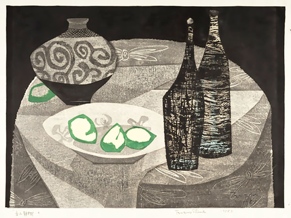 |
| Shima Tamami: Still life with vase, bottles and fruit (409 x 541 mm), 1959 |
In a few works, Shima explored the effects of linearity on representational subjects. They bring to mind the use of similar linear elements by other sôsaku hanga artists such as Kinoshita Tomio, but also Yoshida Masaji in some of his work. Shima's Tobitatsu tori (Birds beginning in flight) from 1959 (ed. 30) portrays highly stylized birds seen in flight over a landscape of rolling hills rendered with differently shaped wedges of parallel lines (see image below). Unlike Kinoshita (or Hiratsuka Un'ichi, for that matter), these lines are fairly smooth and do not have the ragged edges of the tsukibori technique used by those artists.
 |
| Shima Tamami: Tobitatsu tori (Birds beginning in flight), 605 x 848 mm, (ed. 30), 1959 |
By the early 1960s Shima was producing her signature landscapes, some including horses or birds, others with her spiked, leafless trees, or both. Her Samu-kamo tobu fûkei (Landscape with flying ducks: 寒鴨とぶ風景) from 1962 is a typical landscape of this period. This example is from the first edition of 50; later color variants are known, some with a darker palette, others with bright pink replacing the orange, in an edition of 100, also dated to 1962.
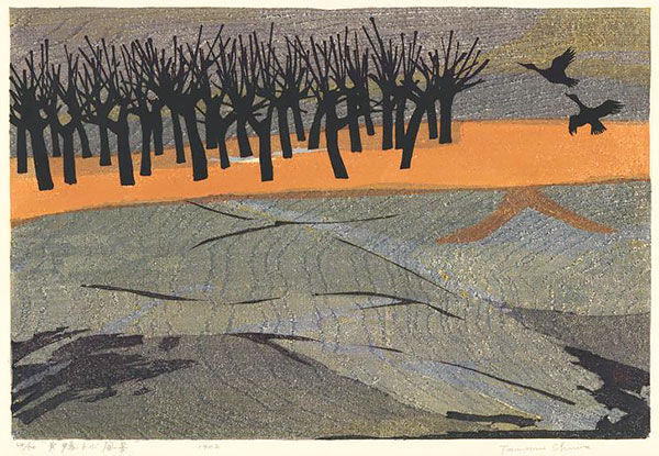 |
| Shima: Samu-kamo tobu fûkei (Landscape with flying ducks: 寒鴨とぶ風景), 351 x 524 mm, (ed. 50), 1962 |
Perhaps the best known design by Shima is her winning entry in the aforementioned Michener portfolio. Titled "Birds (B)," it depicts three birds set against a woodgrain-patterned background. Michener provided one of his most enthusiastic assessments of the works in the portfolio by saying, "From the moment the prints in this contest were assembled, both critics and general public nominated one as pre-eminent. This lyric, exciting work by Shima Tamami has an immediate appeal which does not diminish with familiarity.... the carved line is both artistically pleasing and technically expert ... the three birds are splendidly varied in their attitudes ... the brief suggestion of a woodland ... is cleverly done, while the contrast between sky and water is beautifully achieved.... The simplification attained in this work is admirable, but the depth of joy that shows through the simplification is one of the finest things that art can accomplish.... It is an almost perfect work."
_340w.jpg) Shima used six plywood boards (lauan, basswood, and sen) plus a paper block pasted on a board. The paper was torinoko and the colors were oil pigments from which the oil was removed to allow enhancement of the woodgrain. On average, seven printings of the colors were needed to complete the image. There are differences in grain patterns among some prints because several of the blocks had to be replaced during the course of printing so many impressions (the contest required editions of 510 signed and numbered copies, with an additional 10 set aside for the artist).
Shima used six plywood boards (lauan, basswood, and sen) plus a paper block pasted on a board. The paper was torinoko and the colors were oil pigments from which the oil was removed to allow enhancement of the woodgrain. On average, seven printings of the colors were needed to complete the image. There are differences in grain patterns among some prints because several of the blocks had to be replaced during the course of printing so many impressions (the contest required editions of 510 signed and numbered copies, with an additional 10 set aside for the artist).
Shima offered only a brief comment about her print: "I have worked with the bird motif ever since I first took up prints. In the composition of the present print I treated the birds as still-life objects...."
Shima's prints are in many public collections, including the Art Gallery of Greater Victoria; Art Gallery of New South Wales; British Museum; Carnegie Museum of Art, Pittsburgh, PA; Clark Art Institute, MA; Elvehjem Museum of Art, University of Wisconsin; Harvard Art Museums/Arthur M. Sackler Museum; Los Angeles County Museum of Art; Minneapolis Museum of Art; National Gallery of Australia; National Gallery of Victoria, Australia; Portland Art Museum; San Francisco Museum of Modern Art; Smithsonian Freer Gallery of Art and Arthur M. Sackler Gallery; Weatherspoon Art Museum,
Postscript
Some of Shima's blocks were used to reprint her designs by another artist, Takagi Shirô (高木志朗 1934-1998). Inexplicably, he signed his own name to these reprintings. Like Shima, Takagi was born in Hirosaki, Aomori Prefecture, but he attended a different school, the Musashino College of Fine Arts in Tokyo. He left there in 1958, disillusioned with the college's courses and lack of print expertise among the faculty. Although Tagaki studied printmaking with Amano Kunihiro (天野邦弘 born 1929), he was largely self-taught. He exhibited at various biennales and triennales, winning an award at the 1958 Grenchen (Switzerland) International Color Print Triennale. It has not been confirmed whether Shima and Tagaki knew one another, or whether Tagaki received permission from Shima to print from some of her blocks, or even how he gained access to those blocks. Perhaps corroborating evidence will surface one day to answer these questions. © 2020 by John Fiorillo
BIBLIOGRAPHY
- Kawakita, Michiaki: Contemporary Japanese Prints. Tokyo & Palo Alto: Kodansha, 1967, pp. 52-52 and 185 (for Tagaki Shirô).
- Kuwayama, George: Contemporary Japanese Prints. Los Angeles County Museum of Art, 1972, p. 187.
- Merritt, Helen and Yamada, Nanako: Guide to Modern Japanese Woodblock Prints: 1900-1975. Honolulu: University of Hawaii Press, 1992 p. 142.
- Michener, James: The Modern Japanese Print: An Appreciation. Rutland, VT: Tuttle, 1962, pp. 36-38 and color plate.
Viewing Japanese Prints |