

FAQ: How is a Japanese print made?This brief discussion introduces the traditional method of printing ukiyo-e prints from woodblocks. Modern variations on this method or new techniques are not covered here, but please refer to the bibliography below for other sources of information. Readers are also encouraged to visit Dave Bull's website, Woodblock.com, for detailed, illustrated presentations of many aspects of woodblock printing. [Dave also helped with a few technical details for this discussion.] In particular, you should visit Dave's informative page on "How Prints Are Made," which has captioned illustrations in still-picture or slide-show formats on the process of making prints.
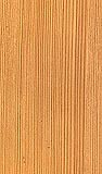
Visible woodgrain is sometimes featured in prints, especially in earlier impressions before wear smoothed down the natural pattern of the grain (see the illustrated discussion on Wood Patterns). While keyblocks were hard, close-grained planks that were planed very smooth, color blocks could be slightly softer and not so close-grained. Occasionally, these softer boards were selected for their rippling patterns to impart texture in large, flat color areas (like the skies in landscapes). If needed the surface grain was "brought up" by applying a roughening paper to the surface to accentuate the grain pattern. The Preparatory Drawing: The artist would provide the publisher with a preparatory sketch of the design, called a 'shita-e' ("preparatory picture"). These sketches varied widely in their completeness or finish. Often the artist would provide only the main contours for his figures and an abbreviated suggestion for a background, whose details were filled in by advanced students or professional block copyists (called hikko). At other times the artist would develop his drawing to a high degree of finish. The final preparatory drawing was then traced by the hikko onto very thin paper (typically minogami). This final block copy of the drawing was called the hanshita-e ("block design" or "block sketch"). Cutting the Keyblock and Color Blocks: The hanshita-e was given to the block cutter, who pasted the tracing face down on the block and often rubbed the paper to thin it further. He then cut through the paper, leaving the lines or areas of the design in high relief while removing the surrounding wood. The final design block was called the keyblock. Separate blocks were cut for each of the colors (sometimes 2 colors were printed from a single block if the color areas were separated by a sufficient distance). Thus on the color blocks all areas were cut or chiseled away except for the flat areas meant to take the colors, which were left in relief (see also Illustrated Stages of Printing). As color prints were made from multiple blocks, the printers required a system of registration to ensure that the image from the keyblock and the colors from different color blocks would register correctly on the same sheet of paper. Thus guide marks were used, called kentô ("pass marks"). A kentô was composed of two guide marks, the right-angled kagi ("key") in the lower right corner, and the straight-line hikitsuke ("draw stop") along an adjacent side (see Kentô diagram). These guides were carved at the same two locations into every block used to make a single design. They were carved a little below the original surface of the wood, thus leaving the main printing surface (the raised-relief design in the keyblock and the raised color areas on the color blocks) slightly higher than the kentô.
Traditional Japanese papers varied in texture due to differences in preparing the pulp and applying the sizing, called dôsa, which was a mixture of animal glue (called sanzembon, made from cooked bovine skins) and alum (called myôban, a solid double sulfate containing aluminum). Papers were typically sized to varying degrees on both sides to prevent excessive absorption of the pigments and sticking of the paper to the woodblocks during printing. On occasion some papers were minimally sized (or not sized at all) to allow for greater absorbency. More sizing meant stiffer, less absorbent paper (more characteristic of modern papers). Still, there was a relatively standard quality for the less expensive, less absorbent commercial papers (generically called kôzo) that can be contrasted with the fairly standardized, high-quality, more expensive, more absorbent, and thicker special occasion papers (generically called hôsho) used for surimono (special edition, privately issued prints). The Pigments: Traditional ukiyo-e colorants were translucent, organic (vegetal) and inorganic pigments of very small particle size. Synthetic colorants introduced from the West in the nineteenth century (probably beginning with bero-ai or "Prussian blue" at least as early as the 1820s) were also of very small particle size. Organic-based pigments were usually complex mixtures including hydrogen, oxygen, nitrogen, or sulfur. Organic pigments probably included safflower (beni) and red bud (suo) for red or pink; gamboge (shio), tumeric (ukon) and miscanthus (kariyasu) for yellow; indigo (ai) and dayflower for blue (aigami); carminic acid from cochineal insect (enji) for a crimson lake; mixtures of various blues and reds to produce purples; and blues mixed with yellows to produce greens. Inorganic colorants included lead white (empaku), mercuric sulfide (shu), red lead (tan), iron oxide red (benigara), and clam shell white or seashell powders (gofun, a calcium carbonate). Our knowledge of traditional Japanese colorants is still rather incomplete. For example, soluble dyestuffs would run or bleed excessively during printing if not insolubilized in an organic or inorganic vehicle, but how this was done in ukiyo-e printmaking is not often known. Single colorants could be mixed or co-precipitated with inorganic porous minerals (called "lakes"), while some colorants were insoluble in themselves. Yet others were mixtures of organic and inorganic dyes or were formed with two organic dyes. There were luxurious special editions of prints issued in small numbers for select groups of collectors. These were made with the most expensive pigments, including metallics and minerals. The printmakers used finely powdered metals or their alloys to add a variety of glitter and color to their prints. Printing metallics and minerals from woodblocks was difficult because when metal powders and minerals such as mica and gofun were mixed on a block with glue, paste, gum Arabic, or other sizing, they tended to stick to the block during printing and did not transfer uniformly to the paper. Still, with care and expertise, metal powders (if not mineral powders like mica) could be printed directly from the wood. First, a glue (nikawa) was spread on the design areas to be printed, then the metal powders were applied to the glue with a very soft brush or a soft cotton cloth or swab, and finally the block was used to transfer (print) the metals to the paper. An alternative method to printing metallic and mineral powders with woodblocks involved the application of glue through a stencil after all the other parts of the design had been printed and the paper was allowed to dry. The stencil was then removed and powdered metals were sifted (called furikake, or "sprinkling") through a fine mesh netting (typically silk gauze) onto the damp glue and pressed gently with a paper or a smooth cotton cloth or swab. Surplus metal powders not adhering to the glue were later brushed off.
Printing the Design: Nearly all printmaking colorants were applied with a brush directly to the color blocks, and then a small quantity of a binding agent made from water-dispersible rice flour paste (himenori) was mixed with the pigment already on the block to thicken the pigment and facilitate control and rubbing into the paper. The paste also improved the uniformity of color and avoided a granular texture upon drying. The dampened paper was then placed on the block while aligning with registration marks carved into the blocks. The colors were then rubbed with a 'baren' against the back of the paper and thus the design thus taken up on the paper's front surface as the colorants and binder were absorbed. As indicated in "Carving the Keyblock and Color Blocks" earlier in this section, the outlines of the design were printed from the keyblock and each color was printed from its own color block.
Readers should refer to the Library in the Baren Encyclopedia maintained by Dave Bull at woodblock.com, or to the following bibliography: © 1999-2020 by John Fiorillo BIBLIOGRAPHY
Return to FAQ |


Viewing Japanese Prints |