

MABUCHI Tôru (馬淵聖)
|
 Mabuchi Tôru (馬淵聖 1920-94) was born in Tokyo, the son of Mabuchi Rokutarô, a wood-engraver and commercial artist who was a pioneer in the airbrush technique, teaching himself through reading books published in France and the U.S. Frustrated at not becoming an artist himself, Rokutarô did all that he could to promote his son's interest in fine art.
Tôru (who romanized his given name as Thoru) initially learned wood engraving from his father. Later, he studied in the craft design section of the Tokyo Bijutsu Gakkô (Tokyo School of Fine Arts: 東京美術学校) in Ueno, graduating in 1941. Although the course included oil painting and drawing, it was focused primarily on the decorative and applied arts. Nevertheless, Mabuchi continued working on printmaking, even exhibiting in major shows. He also attended one of the extracurricular print classes given by Hiratsuka Un'ichi at Ueno. Mabuchi told Oliver Statler, that, "I sketch in oils, watercolors, and pastels but I've never exhibited anything but prints, and I think of myself as a print artist.
Upon graduation, he was conscripted into the army in December 1941, with an assignment to a regiment guarding the Imperial Palace. When the military administrators learned of his skills in art, they directed him to make maps and charts. Thus he never carried a weapon and remained in Tokyo for the duration of the war.
In the years following the war, Mabuchi became active in the art societies of the time, exhibiting works with the Zôkei Hanga Kyôkai (Formative Print Association). He was a member of the Nihon Hanga Kyôkai (Japan Print Association: 日本洋画協会) from 1954 to 1960, when he then joined the newly formed Nipponkai (Japan Print Society: 日本会). More than two decades later, in 1982, he rejoined the Nihon Hanga Kyôkai. Mabuchi also taught at Hiroshima University.
The still life shown at the top right is titled Kaki to yônashi (Persimmon and Western pear: 柿と洋梨) with a date of 1962 and an edition number of 53/100. The image size is 562 x 407 mm on paper measuring 620 x 471 mm. The red oval seal in the right margin reads "Tobin" (杜品), the mark of the notable collector James D. Tobin. In this example, Mabuchi's mosaic technique is on full view, although it is combined with conventional block carving, particularly in the rendering of the green pear at the lower left. Mabuchi's mosaic method is further discussed and illustrated below.
 |
 |
Mabuchi Tôru: Kusaya (dried mackerel: くさや) |
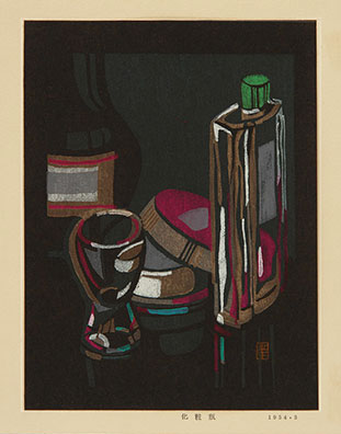
Mabuchi Tôru: Keshôbin (makeup bottles: 化粧瓶) Woodcut, March 1954 (paper: 208 x 160 mm) |
Many of Mabuchi's early works were in small formats. His initial style, before the mosaic technique mentioned above, already marked him as an experimenter in technique among sôsaku hanga (creative prints: 創作版画) artists. There was often a thick, liquid quality to his colorants, and a dark, warm palette. The example shown above left from 1953 is a still life of kusaya (くさや), a Japanese fish delicacy made by brining, fermenting, and sun-drying Decapterus spp. (mackerel scads or flying fish), resulting in a pungent smell but satisfying flavor. Seen from above, the fish and plate occupy an ambiguous position in the pictorial space, seeming to float above as much as rest upon the table surface. Another still life, published in the following year, is titled Keshôbin (makeup bottles: 化粧瓶). Here the dark palette is especially evident (note the bottle on the far left that, except for its label, virtually disappears into the background. The brown bands of color seem to flow down the sides of the tall bottle on the right. All of the pigments are textured and nearly opaque, giving a tactile appearance to the composition.
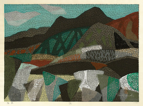 |
| Mabuchi Toru: Kôgen (Plateau or highland: 高原), woodcut, 1960, edition of 50 (paper: 470 x 620 mm) |
When, after the war, Mabuchi took over his father's business, he had the financial security to perfect the intricate mosaic printmaking technique for which he is best known. This approach developed from his interest in Byzantine mosaics and the pointillist paintings of Georges Seurat (1859-91). Mabuchi cut small pieces of very thin wood that he glued to a board in a mosaic-like pattern. "I started," he told Statler, "by attempting the pointillist technique of juxtaposing spots of primary colors, but it didn't work, so I fell back on the mosaic effect." He would make several blocks for a design and once assembled, would print in the traditional way. Among the colorants he used were poster colors and watercolors from tubes. He sometimes made studies in oils before attempting the woodcuts. In Mabuchi's most elaborate works, there were as many as 30 to 50 printing stages from multiple blocks, thus his labor-intensive production was relatively small. An example from 1960 is shown above, one of Mabuchi's mosaic landscapes. Titled kôgen (Plateau or highland: 高原), it is a fairly large work on paper measuring 470 x 620 mm in an edition of 50. Some of the overprinted colors are done with conventional woodblocks, but most of the image is wood-mosaic.
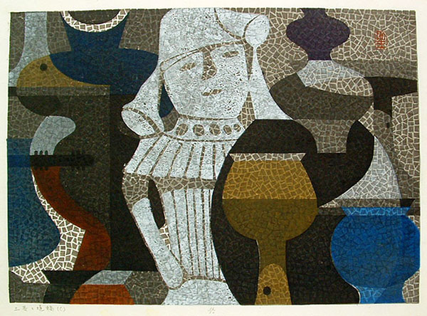 |
| Mabuchi Toru: Doki to haniwa (C) (Earthenware pots and haniwa (C): 土器と埴輪), woodcut 1960(?), edition of 50 (image: 410 x 560 mm) |
Another subject that appears regularly in Mabuchi's oeuvre is the prehistoric haniwa (埴輪), anthropomorphic clay figures found at burial sites. In the example above, Mabuchi depicted a central haniwa figure surrounded by earthenware pots. Titled Doki to haniwa - (C) (Earthenware pots and haniwa (C): 土器と埴輪), it is one in a series of horizontal haniwa portrayals that Mabuchi designed around 1960. The overlapping forms suggest an archaeological site with its scattered treasures.
Mabuchi considered his art thoroughly Japanese, He said, "I want to do something that only a Japanese can do, something rooted in Japanese tradition.... Art is universal, but each country should have its own expression, and I want to contribute to Japan's." In seeking and developing a new technique for his hanga, Mabuchi's personal expression required a break from the past. In fact, since not all of Mabuchi blocks were carved in the traditional manner, but rather assembled as mosaics, judges at official Japanese exhibitions would often argue about whether they were acceptable as "prints" in the conventional Japanese mode, although they seem to have always relented.
Mabuchi's prints are included in the collections of the Art Gallery of Greater Victoria, British Columbia; Art Institute of Chicago; British Museum, London; Brooklyn Museum, New York; Harvard Art Museums, MA; Honolulu Museum of Art; Los Angeles County Museum of Art; and Smart Museum, University of Chicago. © 2020-2022 by John Fiorillo
BIBLIOGRAPHY
- Chigasaki City Museum of Art: Hibi no kôsa — Mabuchi sei no sekai (Daily Brilliance ― The World of Mabuchi Tôru: 日々の光彩 ― 馬渕 聖の世界) [English Title: Tooru Mabuchi Retrospective], 1998.
- Merritt, H. and Yamada, N.: Guide to Modern Japanese Woodblock Prints: 1900-1975. Honolulu: University of Hawaii Press, 1992, p. 82.
- Smith, L.: Modern Japanese Prints, 1912-1989. London: British Museum Press, 1994, pp. 59-60, plate 119 and p. 63.
- Statler, O.: Modern Japanese Prints: An Art Reborn. Rutland VT: Tuttle, 1956, pp. 172-75, plates 99-100.
Viewing Japanese Prints |