

ONCHI Kôshirô (恩地孝四郎)
|
Onchi Kôshirô (恩地孝四郎) — innovative, independent, and charismatic — was a central figure in 20th-century Japanese printmaking. Onchi's experimentation in sôsaku hanga ("creative prints": 創作版画) inspired several generations of artists. Perhaps more than anyone else, it was Onchi who identified the principle of self-carving and self-printing as essential to the sôsaku hanga artist. The printmaker Yamaguchi Gen once said, "Onchi was a vital artist ... he had the inspiration and passion of a great artist. He was the embodiment of modern hanga in Japan and our ambassador to the rest of the world. He was heart and mind, and how we miss him!"
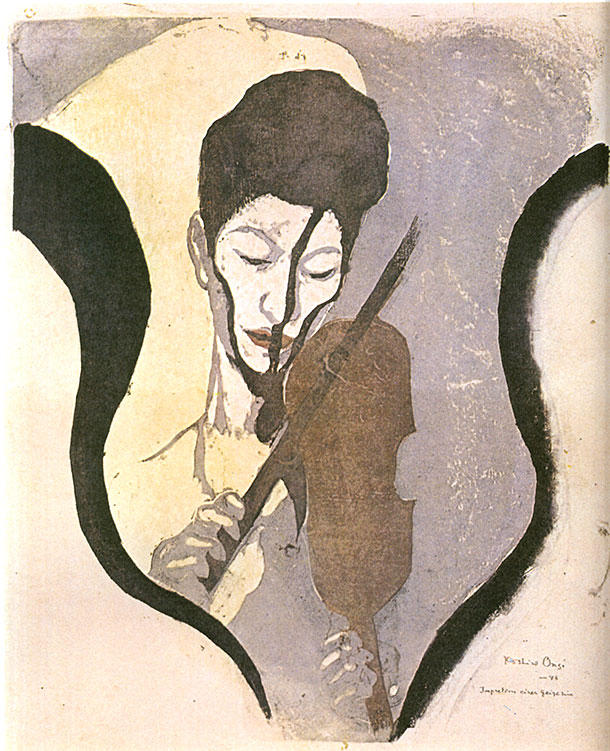 |
| Onchi Kôshirô: Impretion einer geige zin ("Impression of a violin[ist]"), 1946 Also known as Aru baiorinisuto no inshô ("Impression of a Violinist": あるバイオリニストの印象) Suwa Nejiko (諏訪根自子像) in concert before an allied occupation force |
Onchi was raised and educated within an aristocratic family, the son of a high-ranking official of the Imperial Court who was a painter, calligrapher, and scholar of Chinese studies. Later, Onchi attended a Japanese-German middle school in preparation for a career in medicine. His knowledge of German provided him with more direct access to early 20th-century Western art. Onchi identified such painters and printmakers as Wassily [Vasily] Kandinsky (1866-1944) and Edvard Munch (1863-1944), among others, as important early influences. Paul Cezanne (1839-1906) was also an artist he admired. Onchi seems to have rarely, if ever, copied these Western painters and printmakers directly, but rather to have assimilated their compositional styles as he developed his own approaches toward design and technique. Among Japanese influences, the artist Takehisa Yumeji (1884-1934) was particularly important in the earliest years of Onchi's career, and in the non-visual arts, the poets Kitahara Hakashu (1885-1942) and Hagiwara Sakutarô (1886-1942), and the musician-composer Yamada Kôsaku (Kôsçak, 1886-1965).
While enrolled in the Tokyo Bijutsu Gakko Tokyo (School of Fine Arts: 東京美術学校) in 1910 and engaged in Western-style oil painting and sculpture, he quickly rebelled against the dry academic philosophy he encountered there and dropped out after only four months into his second year. His first professional work came in 1911 as a book illustrator and designer, encouraged and assisted by Takehisa Yumeji.
 Beginning in October 1913, Onchi, along with two artist-friends, Fujimori Shizuo (藤森静雄 1891-1943) and Tanaka Kyôkichi (田中恭吉 1892–1915), founded a poetry and print magazine called Tsukuhae ("Reflection of the Moon" or "Moonglow": 月映) that featured both figurative and abstract prints. They called themselves Eishôsai no saning ("Three men of the smile school": 微笑派の三人), parodying the many artists' groups and associations that dominated the official art world. Initially, the young artists exchanged self-printed copies of their designs, gave away a few others as gifts, and sold a very small number of impressions. However, in 1914 Kawamoto Kamenosuke, the proprietor of the Rakuyôdôkan, agreed to publish impressions by subscription (the artist Takehisa Yumeji 竹久夢二 was partly influential in this decision, having vouched for the quality of the prints by the young artists). There were seven published issues in all, from September 1914 to May 1915. The first issue appears to have been published in 200 copies, but sales were very poor. Later editions became increasingly smaller, although it is difficult to estimate just how many copies of each issue were ever printed for public distribution or how many were actually sold. In subsequent years, certain designs by Fujimori and Onchi were self-printed in very small numbers. Complete copies of any edition remain exceedingly rare today. In the published Tsukuhae series, the prints were made not by hand-rubbing the back of the paper with a baren, but with a technique called mokuhan kikai zuri (木版機械摺) or "machine woodblock printing" — a process using woodblocks mounted in a printing press that exerts uniform high pressure to take up the colors from the carved blocks. The colorants were oil-based inks and the paper had a waxy surface quality, presumably to sufficiently control absorption of the oil pigments, which would have been difficult with standard kôzo-gami (楮紙). Over its seven issues, Tsukubae presented a youthful expression of Taishô-period romanticism and angst. Onchi wrote, self-critically, that, "It's thought and feelings were adolescent and its expressions immature." Even so, many of the designs are assertive and memorable. Most notably, issue no. 5 (March 1915) included Onchi's seminal work titled "Lyric: Clear Hours" or "Lyric: Bright time" (Lyric, Akarui toki: 抒情あかるい時), considered today to be the first wholly abstract print ever published in Japan (see image above left). Onchi's daughter, Mioko [Mihoko], claimed that her father had been making abstract prints since 1910, but whichever designs those might have been, they were not published.
In 1930, Onchi wrote about the equivalence between the sounds in music and the colors and shapes in the pictorial arts. Music and art were means through which the artist could find "the heart" or emotional truth. The expression of emotion would be more successful when color and shape were separated from representational art, and so in that sense abstract compositions were the "true sphere of painting." At that time Onchi called this type of art a "lyric."
 In the 1930s Onchi produced a series of small-format abstract designs intended to express his emotional responses to classical music. In Lyrique No. 2: Lyrics on Musical Compositions (Lyrique No. 2: Gakkyoku ni yoseru jojô: 楽曲に寄せる抒情), Onchi constructed at least nine works unified by a distinctive visual language of forms and colors, which he printed in an emotive, expressionist style. The series proved to be a seminal development in establishing abstraction as a modernist printmaking mode in Japan. Onchi admired a great deal of early twentieth-century Western classical music, and the composers who inspired Onchi for his music series were Bartok, Borodin, Debussy, Ravel, Satie, Scriabin, and Stravinsky, plus Western-style composers Moroi Saburô and Yamada Kôsaku.
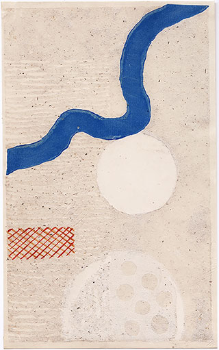
Among the compositions Onchi chose to illustrate was Maurice Ravel's Alborada del gracioso ("Morning song of the jester") — an aubade or love song or poem associated with lovers separating at dawn, harking back to medieval love poetry and ballads. It is the fourth in a five-part suite for solo piano called Miroirs ("Reflections," 1904–1905; orchestrated 1918). Ravel's virtuosic composition, lasting approximately six minutes and the most "Spanish" in his piano oeuvre, is an exercise in rhythm, dynamics, and mood. The opening features brisk arpeggiated chords mimicking the strumming of a flamenco guitar, while triplet motifs call to mind the sounds of castanets. Outer sections feature dance-like tempos with rapidly executed melodies. These bracket a calm recitative-like movement, slow and lyrical, occasionally punctuated by additional dance rhythms, before yielding to a burst of melody and a variant reprise of the dramatic opening. Onchi's woodcut, "Ravel — Alborada del glaciozo" [sic], was printed in an edition of only 10 impressions (the self-printed example shown on the right is 4/10) and is the third design in his music composition series. (Onchi's son Kunio also printed a posthumous edition of 20 in 1993.) The woodcut emphasizes movement across a shallow but richly textured surface. The background is infused with mica, and the two opaque white circles sit thickly atop the paper. A meandering blue band stretches diagonally across the upper half of the pictorial space, moving downward. The white spheres also descend, as does the tilted mesh form at the lower left. The background teems with irregular specks, its left half a field of shallow, unprinted, white horizontal gaps from a woodblock repeatedly gouged with a round chisel. The richly textured surface and placement of forms express Onchi's feelings in response to the sensual nature of Ravel's music.
Given Onchi's great achievements in single-sheet prints, observers sometimes ignore how significant book design was to Onchi's livelihood and aesthetic development. Onchi's contribution to the art of the book in Japan was seminal. He is credited with the design of at least 1,000 book covers/bindings, and illustrated books and their entire contents, not to mention sheet-music covers, posters, and other ephemera. (His daughter Mioko once reported that her father designed over 2,000 books, but whether that figure comes from a rigorous compilation of data is not known; see Troche ref. below.) Perhaps most important, Onchi more or less invented avant-garde book design in Japan. Central to Onchi's eminence as a book designer was Hikô kannô (Sensations of flying: 飛行官能), published in 1934 by Hangasô (版畫荘 Hirai Hiroshi 平井博) in Tokyo. It genesis was Onchi's first airplane flight on July 24, 1927, from Tokyo to Kyushu. Onchi was accompanied by Kitahara Tetsuo (北原鐡雄 1889-1957), later the founding editor in 1941 of Shashin bunka (Photography Culture: 写真文化) and brother of the poet Kitahara Hakushû (北原白秋 1885–1942). Onchi was commissioned by the Osaka Asahi Shinbun (Osaka Morning-Sun Newspaper: 大阪朝日新聞) to design illustrations for a series of articles by Kitahara on flight. The photographs were taken by Kitahara Tetsuo, as well as by staff photographers of Japan Aviation Transportation Co. (Nihonkôkû Yusô Kaisha: 日本航空輸送會社), Osaka Asahi Shinbun, and Tokyo Asahi Shinbun (東京朝日新聞). Seven years later, Hikô kannô was published commercially, for which Onchi designed the woodcuts, block-printed covers, and page layouts; selected the photographs; and composed the verses. All told, there were 32 unnumbered pages, printed by Karikome Minoru (苅米実) in double-page layouts with one to three poems per spread along with their accompanying graphic designs. There is, by the way, an alternate , slightly later version with pages 4-7 rearranged by Onchi, presumably reflecting his personal preference or a correction to the preferred order.
Swinton (see refs. below) summarized the achievement of Hikô Kannô, writing, "Hikô kannô (飛行官能) did not present a linear narrative of Onchi’s experience.... Facing pages are treated as a single unit in which the poems are related to each other and to the visual composition. Within each thematic group, the double page is an independent unit.... Each composition expresses an emotion confined to a particular moment in Onchi’s experience of flight." Moreover, Swinton stated, "Onchi was expressing a new internationalism, defining the nature and function of art in terms new to Japan. Through the combination of various media, Onchi was able to make the airplane — and by extension, the technological and industrial world — an object of artistic experience.... Onchi combined prints, photographs, typography, and poetry to create a unified expression of its theme. Its roots are in the tradition of bookmaking that was ushered in by El Lissitsky [1890-1941 Russian artist, designer, photographer, typographer, polemicist, and architect] and the Russian Constructivists and carried on by Moholy-Nagy [1895-1946 Hungarian painter/photographer] and the Bauhaus during the 1920s. This concept of the book used modern methods of reproduction to erase the boundary between poetry, the visual arts, and the industrial technology of the new typography…. his Hikô kannô (飛行官能) is testimony to the power of modern art as an international language before the Second World War…. Onchi not only arrived independently at nonrepresentational art, he also changed the innovations of the Western modernists. The cold geometry of El Lissitsky and the Bauhaus is totally absent in his work. His reaction to European styles was experimental and intuitive." Roger Keyes (see ref. below) called Hikô Kannô a "brave and uncomfortable book" because it "knowingly reveals so much of himself," and one that "succeeds because Onchi is so ardent and intelligent."
_620w.jpg) |
| Onchi Kôshirô: Hikô kannô (Sensations of flying: 飛行官能), 1934 Double-page layout for the poem Senkai ("Spinning": 旋回) Published by Hangasô (版畫荘) in Tokyo |
Near the end of the book, there is a double-page spread expressing Onchi's response to flying over Tokyo. Here is Onchi's poem (trans. by Swinton): Senkai yokozama no kakaru taito / hageshii sôon o motte kyûsoku ni semaru taito / hito-oshi ni oshite kuru atsuryoku / migi — hidari — zengo / kyôhaku da / kyôkan da / osorubeki kaika da / dosu-guroi taishû / — soshite sore ga watakushi no toku da (Spinning A great city hanging on its side / Swiftly pressing on with violent cacophony / Pressure keeps it pushing onward / Right — left — before and aft / It’s a threat / a shriek / a fearful civilization / Strong dark scent of bodies / — and that is my bed: 旋回 横ざまにかかる大都 はげしい騒音を以て急速に迫る大都 ひた押しにおして来る壓カ 右 — 左 — 前後 恐迫だ 叫喚だ 恐るぺき開化だ とすぐろい體臭 — そしてそれが私の床だ).
To call Hikô Kannô merely a "book" is woefully inadequate. The merging of image and verse into a cycle of expressive responses to a profound personal experience was groundbreaking in Japan. Onchi's comments offer a revealing explanation: "To choose not to use the airplane as a means of making a new art from nature would be absurd.... With the kinds of feelings and emotions I experienced seeing mountains and forests spread out beneath me, I could not draw naturalistically.... It was not (a question of) futurism, cubism, expressionism, illusionism, but the miracle of making something.... Camera-like fidelity from an airplane is completely suicidal." [see Onchi, Atorie ref. below]
Onchi is known to have produced only two oil paintings that were later reinterpreted by him in woodcuts. One of these works will be discussed below; the other was titled "East Gate, Taipei," used in the collaborative series Shin Nihon hyakkei (One hundred views of new Japan: 新日本百景), 1938-41. There was also a large watercolor from 1937 that became the center panel in a woodcut triptych titled Umi ("The Sea": 海). In 1920, during his first trip outside Japan, Onchi visited his older sister Ishizaki Kazue and her husband who lived in what was then a Japanese possession called Formosa (now Taiwan). While there, he painted a view of the side gate to a Confucian temple at Tainan, the former capital of Taiwan. Often called simply "A Shrine gate, Formosa," it is more formally titled Tainan Kôshibyô sokumon (Side gate of Confucian temple, Tainan: 台南孔廟側門). The city of Tainan, located in southern Taiwan, is famous for its diversity and density of temples and shrines, including seven Buddhist temples and eight Taoist shrines. The Confucian temple (also called the Scholarly Temple, 全台首學) in Onchi's work was built in 1665 by Zheng Jing (鄭經 1642-81), eldest son of Zheng Chenggong, better known as Kokusenya or Koxinga (國姓爺 1624-62), for instructors to offer lectures and cultivate intellectuals. It is the temple in Taiwan with the longest history and the first learning institute for children when Taiwan was ruled by the Qing Dynasty (清朝 1644-1911). As a result, the temple is called the First Academy of Taiwan. It houses the mortuary or "spirit tablets" (神位) of Confucius rather than images of the philosopher-sage, as well as those of his distinguished disciples.
 |
Onchi Kôshirô |
Four versions of of Onchi's Tainan Kôshibyô sokumon exist. First, there is an original oil painting from 1920, executed in Onchi's typical dark palette for oils. It is curious that he chose to portray the side gate rather than the small but more impressive front view of the Daiseiden or Ta Cheng Hall (Ch: Dàchéng diàn, 大成殿). The foreground in Onchi's painting at first sight seems straightforward, but actually it's rather complex in its sophisticated mixing and layering of colors. Onchi seems to have been interested here in the effects of sunlight on the earth and vegetation as well as on the surfaces of the red gate and adjacent walls. Onchi's later handling of the scene in his 1936 self-printed woodcut continues this focus on a sunlit foreground and chiaroscuro on the red gate. When Sekino Jun'ichirô, who once owned the Onchi self-printed impression shown at the top right, was asked to produce a small edition (reported as either 12 or 20 impressions in various sources), he, too, explored the nuances of foreground sunlight and shadowed areas of the gate, accomplishing this in the spirit of Onchi's expressive printing, although in a brighter chromatic key. Sekino also shifted the dominant hue of all but the red gate toward blue, a surprise only if one fails to consider Onchi's frequent one-of-a-kind interpretations of the same designs (both realistic and abstract works) throughout his career. There is indeed an Onchi self-printed, blue-palette impression in the National Museum of Modern Art, Tokyo, which possibly served as the model (or some other similar Onchi printing) for Sekino's rendering. Finally, the posthumous impression by Hirai Kôichi falls somewhere between the green of Onchi's works and the blue of Sekino's reprintings, although Hirai's sky is a very bright blue and the overall printing is much harsher than either Onchi's or Sekino's versions.
Onchi employed a varied and sophisticated approach to design, exploring figurative, abstract, and symbolic imagery through traditional and experimental techniques, both Japanese and Western. He was an excellent draftsman in the realistic manner. For example, see his celebrated portrait of the poet Hagiwara Sakutarô* illustrated below. Onchi had worked with Hagiwara in 1917 on the design of a book featuring Hagiwara's avant garde poems entitled Tsuki ni hoeru (Howling at the moon: 月に吠える), published in Tokyo by Kanjôshisha, for which Onchi also contributed three illustrations. (There were two editions, one with expurgated pages 103-108 containing erotic poems.) However, Onchi's explorations into abstract composition must stand as seminal in the development of the sôsaku hanga movement. He used not only woodblocks to print his images, but also diverse, unconventional materials as printing media, such as woven fabrics (including muslin and burlap), string, corrugated cardboard, paper blocks, mimeographed photography, glass, fish fins, seaweed, leaves, charcoal, the heal of a shoe, and the artist's own hand.
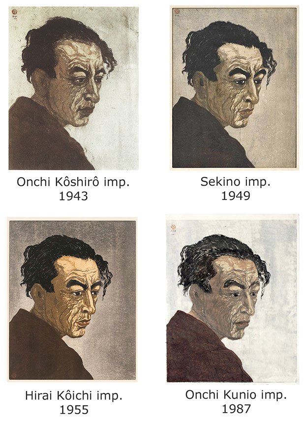 |
| * The post-war demand among American and European collectors for impressions of the Hagiwara image was intense, but Onchi produced very few impressions (probably between 15–20 over several years). Then, in 1949, Sekino Jun'ichirô printed an edition of 50 impressions after some guidance from Onchi. In addition, a posthumous memorial edition of undocumented size was commissioned by Onchi's family and printed in 1955 by Hirai Kôichi. Finally, in 1987, Onchi's son Kunio printed 10 more impressions from the original blocks; seven went to museums and two are in private collections, while the location of the remaining impression is currently unconfirmed. There was also at least one artist's proof. |
The figure at the top of this page depicts the violinist Suwa Nejiko (諏訪根自子 1920-2012) in a concert given in 1946. AIt is known as Aru baiorinisuto no inshô ("Impression of a Violinist": あるバイオリニストの印象) because in the following year, Onchi composed a poem with that title, dated October 12, 1947, which was based on his strong emotional response to the event. (In very few instances, Onchi included a folder for the print design, which has the same title printed on the cover.) The verses speak of Suwa's pale face and white silk robes illuminated by a yellow light, her energetic playing before the allied occupation army audience grating upon Onchi's spirit. The early and very rare impression or trial proof shown here does indeed use yellow on the face and background in evocation of the stage lighting. (It is also inscribed in Onchi's hand with a German title, Impretion einer geige zin, "Impression of a violin[ist]") Onchi ends his poem with a lament for the tragedy of Suwa's art under such conditions, using the yellow color as a metaphor for his sadness. The portrait of Suwa blends representational and abstract elements with an effective use of stark contrasts and limited color. The shadow of the violin bow falls disruptively on Suwa's face. The shape of the violin is also used as a boldly drawn black frame for the composition, as well as for the shape of Suwa's head. Perhaps the repeated shape-within-shape motif implies the confinement of the Japanese spirit in the aftermath of war, as suggested by Onchi's poem.
Onchi's interest in abstract art was evident early in his career, as indicated by his contributions to the aforementioned Tsukuhae and to Gakkyoku ni yoseru jojô (Lyrics on music compositions). During the last 15 years of his life, abstraction came to dominate Onchi's oeuvre. He believed that the purpose of art was the expression of an artist's subjective experience. He was not interested in merely replicating an image from a set of blocks and thus he self-printed very few numbered editions. Onchi viewed woodblock prints as distinctive pictures produced by carving, their essence coming from the special quality and process of using blocks to impart shapes and colors onto paper. For Onchi, this meant an opportunity for experimentation and variation. In some instances Onchi made only one or two proofs from his blocks; if the result was what he wanted, he printed no more. His daughter Mioko once said, "Father always says he'll make more copies for the people who come here pestering us for prints. But he never does." [See Michener ref. below.]
 To demonstrate how experimental Onchi could be, and how disdainful he was of traditional ukiyo-e methodology, Michener had this to say: "In December 1953 Onchi Kôshirô ... made a self-portrait. Onto a slab of ordinary wood he smeared a heavy coating of glue, upon which he wound a thick strand of butcher's cord to form the rough outlines of a human face. When the glue hardened, Onchi hammered the butcher's cord with a big mallet to flatten it out so that it would yield, when ink was splashed across it, a bold, thick line. Then quickly, on a second rough chunk of wood, he cut several areas onto which ink or tempera or oil paint or anything else at hand could be smeared, and when everything was ready he haphazardly pasted down some kentô grooves to give a rough and ready kind of alignment. Then using whatever paper he happened to have, he jammed a sheet onto the blocks, rubbed it vigorously with the heel of his hand and produced a vibrant, coarse, exciting print."
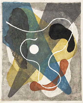
Onchi's use of the title "lyriques" in various series on non-musical themes heralded further exploration into the expression of subjective feelings. Emotion was paramount. Similarly, he used "impromptu" in some titles, which was often meant to convey a feeling of spontaneity. The composition immediately on the right is titled "Lyric No. 32" and dated 1955, Onchi's final year. The size is 550 x 430 mm. In his mature treatment of the "lyric" theme, Onchi achieved a notable synthesis of color, shape, and density. There is an allusive musical quality to the placement of the forms and their rhythms. Transparent colors overlap and mutate, darker areas obscure paler ones, altering colors, while textures add dimensionality and physical presence, and floating shapes introduce movement. The composition is in flux, intentionally ambiguous, but the impressive control of the print medium and non-traditional print materials argue against chaos. The receptive viewer feels the resonant emotional power of such designs. © 2001-2020 by John Fiorillo
BIBLIOGRAPHY
- Catalogue of Collections [Modern Prints]: The National Museum of Modern Art, Tokyo (Tokyo kokuritsu kindai bijutsukan shozô-hin mokuroku, 東京国立近代美術館所蔵品目録). 1993, pp. 75-77, nos. 654-671.
- Christie's: "The Helen and Felix Juda Collection of Japanese Modern and Contemporary Prints." [auction] New York: April 22, 1998, lots 48-122.
- Hisae Fujii, "Kôshirô Onchi's Prints," in: Kôshirô Onchi and Tsukuhae. National Museum of Modern Art, Tokyo. July 2 – August 15, 1976.
- Keyes, Roger: Ehon: The Artist and the Book in Japan. Seattle & London: The New York Public Library with the University of Washington Press, 2006, pp. 250-251, no. 64
- Kuwahara Noriko, "On Onchi Kôshirô’s 'Lyric on musical composition' series: a case study of Japanese abstract painting in the 1930s" [Onchi Kôshirô no ‘gakkyoku ni yoru jojô’ shiriizu o megutte: 1930 nendai no Nihon no chōshō kaiga ni kansuru ichi kōsatsu], in: Bigaku [Aesthetics], Japanese Society for Aesthetics, Bigakukai, 2003.
- Kuwahara Noriko, Study of Onchi Kôshirô: modernity in Japanese prints [Onchi Kôshirô kenkyû hanga no modanizumu], Serica Shobô, Tokyo 2012.
- Matsumoto Tôru, Kumada Tsukasa, Inoue Yoshiko, Onchi Kôshirô. National Museum of Modern Art, Tokyo and the Museum of Modern Art, Wakayama, exhibition catalogue, Tokyo 2016.
- Merritt, Helen: Modern Japanese Woodblock Prints. The Early Years. Honolulu: University of Hawaii Press, 1990, pp. 178-199.
- Michener, James: The Floating World, Honolulu: University of Hawaii Press,1954, pp. 249 and 252.
- Onchi, Kôshirô: "Kûchû fukan fûbutsu (A bird’s-eye view of landscape)," in: Atorie [Atelier], September 1927, vol. 5, no. 9, pp. 137-138.
- Onchi, Kôshirô: Hon no bijutsu (Art of the book: 本の美術). Tokyo: Seibundo Shinkôsha (誠文堂新光社), 1952.
- Sotheby's: The Roy G. Cole Collection of Fine Sosaku Hanga. [auction] New York, June 19, 1990, lots 57-93A.
- Statler, Oliver: Modern Japanese Prints: An Art Reborn. Rutland & Tokyo: Tuttle, 1956. [Quotation in first paragraph above excerpted from p. 158]
- Swinton, E. de Sabato: "Hikô Kannô," in: Archives of Asian Art (University of Hawai'i Press for the Asia Society), 1976, pp. 85-100.
- Swinton, E. de Sabato: The Graphic Art of Onchi Kôshirô: Innovation and Tradition. [Dissertation, 1980] New York: Garland Publishing, 1986.
- Troche, E.: Koshiro Onchi, 1891-1955, Woodcuts. San Francisco: Achenbach Foundation for Graphic Arts, Exhibition, July 11 to Sept. 20, 1964.
Viewing Japanese Prints |