

Lateral and Transverse Block WearExtensive use or damage will alter the topography of a woodblock. "Lines" for ukiyo-e prints are cut into hardwoods (typically cherry) in the form of pyramidal ridges to produce raised lateral surfaces that will take the pigments for printing lines (or to produce raised surfaces in somewhat softer woods for color patterns). If the raised forms were cut straight down (perpendicular to the plane of the board), or worse, angled inwards, the ridges would be more likely to break. The narrowest line-ridges, especially those used to print the fine lines of the face or hair in ukiyo-e designs, are particularly susceptible to wear along the contours of the ridge (lateral wear - see red line below). As these narrow ridges break apart, the printed lines begin to show irregular edges and gaps.
In addition to breaking up along the edges (laterally), ridges may also wear down towards the surface of the block (transversely), caused by transverse compression of the ridge. In the blue line example above, the edges are relatively uniform. Small irregularities, such as the tiny depression shown at the top right of the ridge, will often transfer "complete" lines to paper because they will fill up with pigment; however, as these depressions increase in size, printing becomes uneven within the contours of the lines, resulting in a blotchy appearance. As the top of the pyramidal ridge wears away, there is more lateral surface area (lower down in the worn ridge) to hold the pigment. Thus transverse wear results in a widening of the printed line, although often with an accompanying loss of sharpness or definition along its edges (laterally). It is probable that this type of downward, transverse wear occurred more frequently with the softer woods often used for color blocks or for printing contour lines without the use of a keyblock. Softer woods were more prone to compression and wear as the printers rubbed and pressed the papers on the inked blocks. This is particularly true when many hundreds or thousands of impressions were made for multiple editions, sometimes spanning years or decades. Examples of lateral block wear in an Osaka print To illustrate wear on the edges of line-ridges, scans were made of three original prints made from the same blocks. The design was first published in 1848; the artist was the Osaka master Hirosada. In the first group, enlarged details show the fine lines used for the face of the actor Arashi Rikan III. We should keep in mind that scans at such magnifications will show imperfections in all examples, even with the earliest impressions. When viewing at normal size, the human eye tends to "fuse" some of these minor irregularities. In the earliest example (A), only slight block wear or irregularities are evident. In the second example (B), noticeable weaknesses can be seen throughout, especially in the eye lines and along the bridge of the nose, including complete breaks. In the third example (C), the eye lines are almost too faint to be seen, and the bridge of the nose is weaker and thinner. However, the printer was able to coax a stronger line to the right of the nostril. It is doubtful that he did this with any great purpose — it might have happened as a result of random excess inking, greater pressure exerted during printing, variable sizing (dôsa) in the paper, or some combination of these factors. [Various late-edition prints are known, however, in which worn-out blocks were printed as boldly as possible to camouflage line weaknesses.]
The next set of comparisons shows details of the actor's thumb from the same original blocks as in the previous illustrations. Thicker lines like these will print uniformly and with relatively consistent sharpness in early editions (A). As block wear progresses (B), the lines begin to show irregularities, although the differences are rather more difficult to discern than in the comparison of the more fragile facial lines. As expected, thicker lines will hold their form more securely for longer periods of block usage than will fine lines. Nevertheless, the late impression (C) demonstrates how even the once bold ridges can wear down and ultimately produce enfeebled lines with jagged edges. Note, too, that in this and in the previous comparison group, there is no widening of the lines from block wear — in fact, quite the opposite is true.
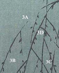
Examples of the widening of lines in a shin hanga print The following illustrations were taken from three impressions off the original blocks for a design by the 'shin hanga' artist Takahashi Shôtei. [These scans are courtesy of Marc Kahn, who identifies them as "post-earthquake" impressions (i.e., after 1923). The complete image can be found at Shôtei: Spring Evening, and Marc's discussion about variant Shôtei designs can be found at Shotei Copies.] They illustrate how line-ridge wear can vary from the same block. In the earlier edition, the long curving branch at the far left is fairly strong and uniform (1A), while the middle edition shows weakening of the line (2A), which all but disappears in the late edition (3A). In the two later editions there appears to be evidence of a complete loss of a leaf visible only at 1B, as it is missing from 2B and 3B, presumably due to the breaking off of a line-ridge. Line thickening (transverse wear) can be seen in several instances. For example, the vertical branch bending toward the right and already showing some wear at 1C has a large gap above 2C, while at 3C the lower part remains but spreads out or widens with rather poor definition at the edges. Similarly, the leaf at 1D weakens and loses definition at 2D, and then expands and nearly fills the intersection with the two branches just above it (3D), which have themselves also widened. © 2002 by John Fiorillo
Return to the FAQs: Grading Quality and Condition or Identifying Different States or Editions. |


Viewing Japanese Prints |