

Woodgrain Patterns
|
 One technique used to enhance the expressive application of colors in woodblock printing involved the intentional use of woodgrain (visible in traditional printing blocks, which were cut parallel to the grain of the tree). Called kimetsubushi ("uniform grain printing"), the process involved working the surface of the wood with stiff brushes or rubbing with pads to roughen the surface and thereby impress the paper with the grain pattern in areas of relatively uniform or "flat" color.
Unlike the close-grained hardwood that was planed smooth for use as the keyblock (to print the main outlines of a design), ukiyo-e color woodblocks were sometimes selected for their more prominent grain patterns. Printers would use these decorative patterns in large monochrome color areas or in gradated skies and water. Occasionally the patterns closely resembled natural phenomena like radiant heat, rippling water, or refracted light in the sky. At other times, the patterns were simply used to achieve an interesting graphic effect.
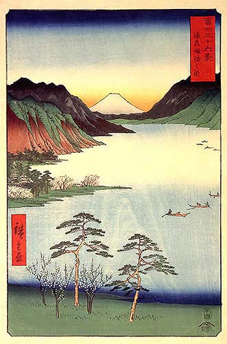
The image on the right illustrates an ôban-size print by Utagawa Hiroshige I (1797-1858). The scene is Lake Suwa in Shinano Province from the series Fuji sanjûrokkei (Thirty-six Views of Mount Fuji: 富士三十六景) published by Tsutaya Kichizô. The date seals for all the prints in this series read Uma-shi ("Horse 4," or fourth month, 1858); however, the table of contents and preface are on a sheet titled Meisho sanjûrokkei (Thirty-six famous views: 名所三十六景), which is stamped with a censor seal for 1859. It would seem, therefore, that the designs were approved and the blocks cut in 1858, but the series was not actually published until the following year. The writer of the preface, Shunba Santei, states that the designs were Hiroshige's last and that their publication served as a final memorial to his life's work.
This early impression shows the use of woodgrain, perhaps to suggest wave patterns in water. True to ukiyo-e conventions, the woodgrain effect is not entirely integrated into the depth of field, as the pattern floats above the water in a non-receding perspective. A single vanishing point for perspective, as was the standard in occidental art, was not a concern of the Japanese artist or printer, whose main goal was the decorative depiction of texture and the movement of water. Woodgrain patterns such as this one are also considered by collectors and curators to be indicators of early impressions. When large editions were published, the softer woods used to print the colors often wore out before completion of the editions, and the grain patterns would slowly disappear. Thus later editions typically show little or no kimetsubushi.
A modern artist who used the natural grain patterns from plywood was Tamami Shima (島珠美 1937-1999). She was a graduate of the Women's College of Fine Arts in Tokyo. Her work was promoted in the West when she was selected as one of ten winners in a print competition sponsored by James Michener (see reference below). Shima's designs are notable for their use of texture and form, and especially for her striking use of various woodgrain patterns within a single image.
 |
 |
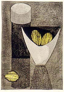
The two examples shown above are still lifes with shallow, multiple perspectives and ambiguous depth in the pictorial space. The limited receding space serves to aid the observer in focusing upon the textures and patterns. So does the simplification of forms. The print of lemons in a bowl is dated 1961 and numbered 94/100. Shima used oil-based inks with a granular texture in the deep black areas, and she was clearly interested in exploring the effects of light and shadow in a semi-realistic manner; however, the source of light shifts and casts shadows from different directions within the composition. The somber palette is punctuated by the vivid yellow used for the lemons, with their forms striated by the grain patterns from the woodblock. The design on the immediate right was published in 1959 and is numbered 16/30. The fish are placed on a table and viewed from above, whereas the empty bowl is seen from a lower vantage point. The bold table pattern dominates the background, but the sharp block cutting and dense black printing of the fish bring them to the front surface of the composition. They appear to float slightly above the table as much as they seem to rest upon it. Alternate types of woods were used for the bowl and the shapes surrounding the table top, which produce interesting contrasts in patterns and textures.
 Another modern printmaker who created a variation on the use of woodgrain patterns was Tomio Kinoshita (木下富雄 1923-2014) who cut many of his blocks entirely with a single cutting tool, a U-shaped gouge. He use it to form irregularly shaped but roughly parallel lines to define shapes such as the faces and bodies of partly abstracted human beings. The figure below left is a print in large format on paper measuring 422 x 355 mm. The lower margin has the signature ("Tomio Kinoshita"), the title "Face" in English and Tatsu-onna in Japanese ("Dragon Woman: 竜女). Carved in 1960, the edition size was 50, but not completed until commissioned by the late Japanese print dealer Paul Schweitzer (Washington, DC) in 1985. The dating of published prints with the year of issuance and not the year of block cutting was a common practice among sosaku hanga artists. The orange color is the result of mixing carmine with vermilion water-based pigments.
Kinoshita expressed a strong interest in making rather bold statements about the suffering of human beings, which led him to develop his typology of abstracted faces or masks. By carefully varying the distances between lines he was able to suggest the shapes of eyes, mouths, noses, cheekbones, necks, and hands (see detail figure on the immediate right). What is most interesting in terms of technique is the manner of cutting each line, not so much in imitation of printing with woodgrain, but for the purpose of achieving a pictorial and emotional effect through an invented pattern suggestive of natural forms. In the designs where the heads are squared off, as here, Kinoshita created a severe "human geometry" of singular impact. For much more about this artist, see Kinoshita Yomio.
 |
| Saitô Kiyoshi: "Buddies (B)" (edition 80), 1974 |
The sôsaku hanga (creative prints: 創作版画) artist Saitô Kiyoshi made a number of clever "portraits" of cats that featured extensive use of woodgrain. For example, in a lineup of cats called "Buddies (B)" (see image immediately above), Saitô drew silhouettes or outlines of five felines and then endowed each with an individuated pattern of woodgrain in place of what have been their fur. These textures are so eye-catching that they seem as much the subject of the print as do the cats. For another example, see Saitô Kiyoshi. © 1999-2020 by John Fiorillo
BIBLIOGRAPHY
- Doesburg, Jan van: What About Kunisada? Dodewaard: Huys den Esch, 1990, pp. 114-115, plate 46.
- Izzard, Sebastian: Kunisada's World. New York: Japan Society & Ukiyo-e Society of America, 1993, pp. 182-185 and plates 96/1- 96/9.
- Link, H., Hiroshige: The James A. Michener Collection. Honolulu Academy of Arts, 1991, vol. 2, p. 34.
- Michener, James: The Modern Japanese Print: An Appreciation. Rutland: Tuttle, 1968, pp. 31-34.
- Petit, Gaston and Arboleda, Amadio: Evolving Techniques in Japanese Woodblock Prints. Tokyo & New York: Kodansha, 1977, pp. 21 & 80, figs. 6 & 86-87.
Viewing Japanese Prints |