

Interview with Dave Bull — "Hokkei's Fuji"
The contemporary printmaker Dave Bull was inspired by this view of Fuji to include it in his 'surimono' album for the year 2000. As he did not own one of the rare original impressions, Dave used a Meiji-period copy as a model for his reproduction. Meiji artisans had recut the keyblock lines, and only the poem by Ryûeko Itonaga was retained. Dave's print, created with notable skill, raised some questions in my mind about the process of making such copies, and so in October 2001, I decided to discuss some of these ideas with him. Our conversation is summarized below. © 2020 by John Fiorillo
Conversation with Dave BullJF: Mt. Fuji is a well-known symbol of Japan, so your choice of the "sacred mountain" as a subject for your surimono album would surprise few who are familiar with its significance and widespread popularity in Japanese printmaking. Did you consider the larger meaning of representing this icon of Japanese landscape and culture when you made your version? In other words, did you attempt to create a special atmosphere in your choice of colors or the manner in which you printed them, or did you focus, instead, primarily on the technical details, working to get the image "right" with Hokkei as your guide? DB: I'm not quite sure where to start to answer this, John. You and I look at these prints in such different ways! The 'quick and easy' answer is that I approach the work on each print I make as 'simply' a technical challenge — I try to reproduce something that was made all those years ago as closely as I possibly can. Questions like 'the larger meaning' don't really enter into it at all. In my choice of this particular design, and its placement as the 'New Year' image in the album, I obviously took a wider point of view, but once such decisions are made and the carving work begins, there are really no philosophical decisions left — purely technical ones. When the goal is to make a reproduction, as it was in this case, I work to reach the same target that the old craftsmen did — to get Hokkei's conception down on paper for the viewer as best I can. JF: One reason I find Hokkei's Fuji so impressive is that it has a timeless quality of simplicity, a paring down to the essentials without sacrificing meaning or effect. As a result, this design is less complex in terms of line and form than other prints you have made. Did this affect your approach to carving and printing? For example, were you even more concerned than usual about the quality of the lines or the texture and depth of your colors, than you might have been in making a more complex print? DB: No, not at all. To answer the question backwards, if I were to start to take the viewpoint, "Well, I don't need to be so careful on a print, because the design is so complex that people won't notice such-and-such a detail," then I would have trouble looking in the mirror each morning! So when the print is more simple and 'clean', like this one, it doesn't become any easier. There were aspects of this design that did make the work a bit easier though - the darker blue gradation at the bottom is one example. That gradation on the originals — both the old Edo one and the Meiji copy — is done in a quick 'freehand' manner, and if you were to study multiple copies of those prints you would find considerable variation from copy to copy. This differs from the type of gradation you might find on an Utamaro kimono pattern, for example, which would be very smooth and clean, and precisely placed. So in that sense, this design allowed a bit more 'relaxation' while printing. JF: You wrote on your website that the metallic pigments on Hokkei's print were design elements that attracted you to work with powdered metals on your own version. Was there anything else about this particular Fuji that appealed to you? DB: The point about the metals was simply that I hadn't yet had the chance to make a print using that technique. My Surimono Albums aren't made just for the collectors' pleasure, but for my own, too! Traditional printers of old had no say in the work that they did; they just accepted whatever came down the pipe from the publishers. In my case, if I don't try to stretch out and investigate different techniques, I'll never learn how to do them. But over and above that, the obvious and immediate beauty of this design was a compelling reason to make the print. JF: You have also written on your website that the Meiji copy is beautiful — with its bronze oxidized and the paper warmer in tone, which you find more pleasant to look at than your own print. I wonder, however, whether the "bright and very clean" appearance that you find less appealing was actually part of Hokkei's intended result. For example, I suspect Sidney Ward's description of reflected sunlight would be more effectively expressed by an impression in untarnished condition. Does this strike you as plausible, and would it "elevate" a pristine original or your own work when viewed with this effect in mind? DB: Well, you are touching here on one of the major 'problem' areas in making reproductions. There are two vastly different ways of approaching the work: to make prints that look like the originals looked when they were new (as the Adachi Hanga Institute does), or to make prints that have the general appearance of gently aged old ones, like Takamizawa did when they were still in business [JF: see Takamizawa]. There is also a third way — to make prints that are intended to be indistinguishable from originals ... forgeries, in other words. But let's leave that one aside! Most of my work to date has been done in the first method — my prints have looked clean and bright, presumably not too different from the originals of the day. I didn't particularly choose this method, but didn't have much choice — my blocks, pigments and paper are all new, so of course the resulting prints looked new and fresh. But I am growing more and more dissatisfied with the cold and hard appearance of the prints, and am starting to move towards giving them a more soft and toned appearance. I don't intend to start giving them all 'tea baths' and rubbing old cobwebs over them, but I am going to start toning the paper and washing out some of the brittle sizing (neither of these things will affect the longevity of the print, I believe). It's a lot of extra work, but I think the result is worth it. To get back closer to your question, of course I would think that an original that had been stored very carefully, and thus looked more like it did 'back then' would be preferable to one that had been hanging in a frame for a century, but even with the most careful storage, the passage of a hundred years or so leaves a pretty heavy trace!
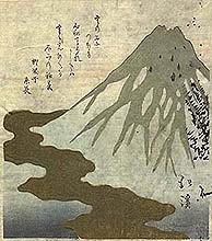
DB: Boy, this one needs a whole essay to answer! Over and above what I mentioned a moment ago, about 'two ways' to make reproductions, is this question of paper. Paper, or more specifically, the impossibility of getting good paper, is far and away my single biggest headache. So when you ask me, "Have you ever considered attempting to locate old papers," I'm tempted to break down crying! I should be a bit careful what I say next, because the man who makes my paper is a Living National Treasure, and without question one of the best papermakers in the country. His paper is 'the best that money can buy'. But what I want — money can't buy! I want paper that is as smooth and finely made as it was a hundred years ago. That's an impossible dream, of course, because we can no longer ask our papermakers (and their suppliers) to work in the slave-like fashion necessary to produce that sort of paper. People back in the Meiji era didn't have much choice, but modern craftsmen, good as they are, are no longer willing to sacrifice all semblance of a normal life to their craft. Is there really that much difference? Yes, yes, and yes! The front surface of modern paper is so rough and uneven compared to that of even just a few decades ago, that one must press the baren (printing tool) very firmly onto the back of the paper in order to get a good impression. But by doing so, all the character of the delicate carving is lost. On those extremely rare occasions when I have had a chance to print on old paper (as when I was making the print you see here — on paper from about 1780), the difference is astounding. Lines carved as fine as hairs actually print that fine, something completely impossible when using modern paper. And then should we talk about pigments? It's, of course, exactly the same story. In truth, the job that I try to do — to make an 'accurate' reproduction of an Edo print — is in fact now completely impossible. The prints I make are pretty well made, but we will never see the like of those old prints ever created on this planet again. Never! JF: Do you find that the quality of the block carving and printing differ in significant ways between Edo-period originals and Meiji-period copies of surimono, and if you do, how does this affect your own approach toward making your reproductions when using one or the other type of print as your model? DB: I would hesitate to generalize too much about the quality of carving from different eras. In any given time, the quality of carving varied immensely from person to person, as there were so many men working in the field, carving and printing everything from food wrappers to delicate surimono. Of course, the Edo surimono were generally made by top-level men, but when we look closely at good Meiji work, we find the same breathtaking level of ability, too. Talking about these things with carvers here in Japan, I get the impression that the 'top' standard is generally held to be the man (men) who carved the first two volumes of Hokusai's 'Hundred Views of Fuji', but I myself am pretty impressed by a lot of what I see in the best Meiji work. But as far as how any such differences affect my own approach — all I can try to do is get as close as I can to the 'original' of each particular print that I am working on. A far more difficult challenge than worrying about different eras is the vast stylistic difference between 'designers' or the people who created their hanshita, the tracings for carving. You just can't carve a Hokusai in the same way that you carve a Hiroshige. JF: Is there anything else that you would like to say about making your copy of Hokkei's Fuji? DB: I'm not sure what else to add. I chose it because I liked it and also wanted the challenge of the new techniques that were involved. When it was done and the 200-plus copies were sitting in a stack on my desk, I was pretty pleased with how it turned out, and the subsequent feedback from the collectors was positive, too. I said a silent 'thank you' to Hokkei and the craftsmen who made the original, then put it aside, forgot about it, and got to work on the next one. That's the way it goes, month after month after month. © 2001 by John Fiorillo and Dave Bull BIBLIOGRAPHY
|
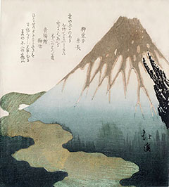 The design featured on this page shows Mount Fuji rising above a "river" of clouds. It is from an untitled set of three New Year's
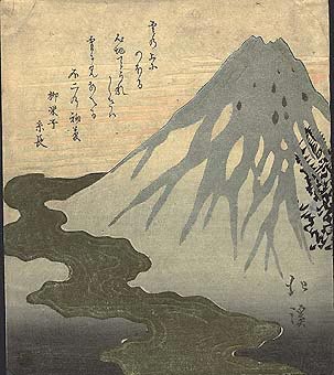
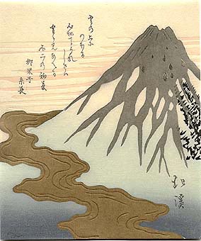
 JF: Modern reproductions certainly have a different "look" when compared to originals. Some of this must, of course, be due to the aging process of the originals. This difference also derives from the amazing handmade papers and the vegetal or organic pigments of the 17th - 19th centuries. Colors in Edo-period prints sometimes have a unique, almost contradictory quality of transparency and depth that I have yet to find in modern prints. You experimented with making an impression of your Hokkei copy on paper from an Edo-period book (see illustration at right), but that paper was rather thin, unlike papers used for most Edo-period surimono. Have you ever considered attempting to locate genuine old surimono papers and printing an edition with natural colorants to move your copy closer to the original?
Viewing Japanese Prints |