

Modern Stencil Prints: Kappazuri-e (合羽摺絵)
|
 Mori Yoshitoshi (森義利 1898-1992) and Watanabe Sadao (渡辺 禎雄 1913-1996) are the two best known sôsaku hanga artists to use the medium called kappazuri (stencil printing: 合羽摺), a technique related to katazome (stencil dyeing: 型染). Katazome is said to have originated in Okinawa; the method there was a resit-dyed technique called bingata ("red style": 紅型).
The paper most widely used in Japan for stencil printing is called shibugami, made from several layers of kozô paper laminated with persimmon tannin. The sheets are dried and smoke-cured to strengthen them and make them flexible and waterproof. Once the artist makes a drawing, it is fixed to the shibugami with a thin adhesive. The basic pattern is then carved into a "key impression" stencil (the equivalent to the keyblock in woodblock printing) called the omogata. If colors will also be used for the final design, separate stencils are sometimes cut for each color. If the stencil pattern has thin lines they can be reinforced with silk gauze, which still allow for uniform printing of colors.
The first stage of the printing process involves the application and drying of a dye-resist paste to cover all the portions of the design to be left unprinted by the design. The patterns and colors can then be brushed over the stencil while affecting only those areas without resist paste. Typically the first colors printed are the lighter hues so that darker colors can be overprinted. After all the colors are printed and dried, the key impression stencil is finally used to print the key design over all the previous colors (see photos below right of Mori working on the color proofing and black-pigment application stages). The dye resist paste is then washed off (called mizumoto, "to wash by water") and the paper is dried on a wood board.
 The two artists shared similar formative artistic experiences. In 1940 and 1941, respectively, Mori and Watanabe first met and worked with Serizawa Keisuke (1895-1984), a master of stencil-dyed illustrated books who was a leader in the folk art movement (he later received the Award of Cultural Merit from the Japanese government in 1977). Serizawa Keisuke's influence on Mori and Watanabe was considerable (as it was on Shikô Munakata). They were involved as well with the founder of the folk art movement, Yanagi Sôetsu (1891-1961), who advocated an honest and dedicated approach to traditional techniques and materials.
Although both Mori and Watanabe made some woodblock prints, nearly all their works were stencil-dyed prints. They experimented with various types of papers, but the most obvious difference was Watanabe's use of a type of kozô paper called momigami (crumpled, wrinkled paper), which was a thick paper purposely crumpled by hand and then only partly smoothed out before printing. It gave his prints a deeper, rough, and more expressive texture than would have been possible with smooth papers.
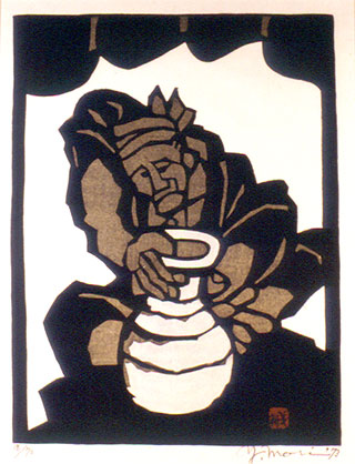
Mori Yoshitoshi, who began as a textile designer, first made monotype kappazuri on wood blocks and glass in 1951 and exhibited his firs kappazuri-e on paper in 1954 at the Nihon Bangain (Japan Woodblock Academy) after receiving encouragement from Yanagi Sôetsu. He straddled the worlds of the artist and the artisan-craftsman until 1962, when he moved closer toward artistic expression through kappazuri-e, resulting in Serizawa Keisuke criticizing Mori in a well-known debate for abandoning the crafts movement. Mori thereafter devoted himself to the art of kappazuri-e. His subjects included kabuki scenes, craftsmen, festivals, and figures from traditional stories. He printed on both colored and unprinted grounds. The figure at the top right illustrates an example from a series of seven prints from 1973 depicting artisans. Although untitled, this design is known as "Potter under Tiled Roof." It is signed "Y. Mori," dated "73," and numbered 18/70. Arguably the best design from the group, the strength of the potter is admirably portrayed as he works the clay to form the vase. The simplicity of the roof and the boldness of the figure add a sense of monumentality to the design.
 Although the techniques of the two artists were similar, their subject matter was not. Watanabe Sadao, who was baptized a Christian in 1930, based his designs exclusively on biblical subjects, although his Christian stories and figures are interpreted through a filter of traditional Japanese techniques and show the influence of old Buddhist figure prints. Watanabe typically printed on a colored ground, so he would first apply a color to the paper before taking the other steps described earlier.
In the figure on the right, a yellow ground was printed before the stenciling of the other colors and key impression outlines for one of several similar designs by Watanabe portraying ithe Madonna and Child. The print was made in an edition of 70 and is signed "Sadao Watanabe" and dated 1977 in white pigment. The figures are iconographic in manner and bold frontality, recalling pre-Renaissance Madonnas and perhaps even Russian religious icons from the 17th-19th centuries mixing Western European realism with highly stylized modes of representation. The simplification of forms and patterns gives the image a quality of timelessness that perhaps Watanabe meant to express, at least on an intuitive level. © 1999-2020 by John Fiorillo
[See more about Watanabe Sadao.]
[For an early Osaka stencil print artist, see Nagahide.]
BIBLIOGRAPHY
- Abe, Setsuko and Matsuoka, Haruo: Mori Yoshitoshi Kappa-ban. Tokyo: Mori Exhibition Organizing Committee, 1985, pp. 9-23 & plate 109.
- Watanabe, Sadao and Takenaka, Masao: Biblical Prints by Sadao Watanabe. Tokyo: Shinkyo Shuppansha (Protestant Publishing Co.), 1986.
- Watanabe, Sadao: Printing the Word: the Art of Watanabe Sada., New York: American Bible Society, 2000.
- Watanabe, Sadao: Heeding the Voice of Heaven, Sasao Watanabe Biblical Stencil Prints. Valparaiso: Brauer Museum of Art, 2010.
- Michener, James: The Modern Japanese Print: An Appreciation. Rutland & Tokyo: Tuttle, 1968, pp. 23-31.
- Smith, Lawrence: Modern Japanese Prints 1912-1989. London: British Museum Press, 1994, pp. 35, 55-56 and plates 68-72 & 74.
Viewing Japanese Prints |